People often ask me why my food product is failing to set a unique brand identity. The answer is simple: you must stand out from the crowd.
Food packaging design is not decoration. It is branding and marketing in its most visible form. A smart food package design makes people stop, look, and buy. When the packaging feels unique yet relevant, you already win half the battle. Do your family members or friends read ingredients before buying a food item? Or do they check out nice-looking packaging? IYKYK.
We live in India, where packaging value matters emotionally, too. Offer coffee in a solid glass bottle, and many women will choose it just to reuse that bottle. That is the power of food box packaging design. It creates desire beyond the product itself and builds everyday brand recall.
So what makes Go To Clan a trusted food packaging design agency? Our designs stand out even when the shelf is full of your competitors’ products. We focus on clarity, attractiveness, and real-world buying behavior. Below are real use cases that show how the right food package design changes how products sell.
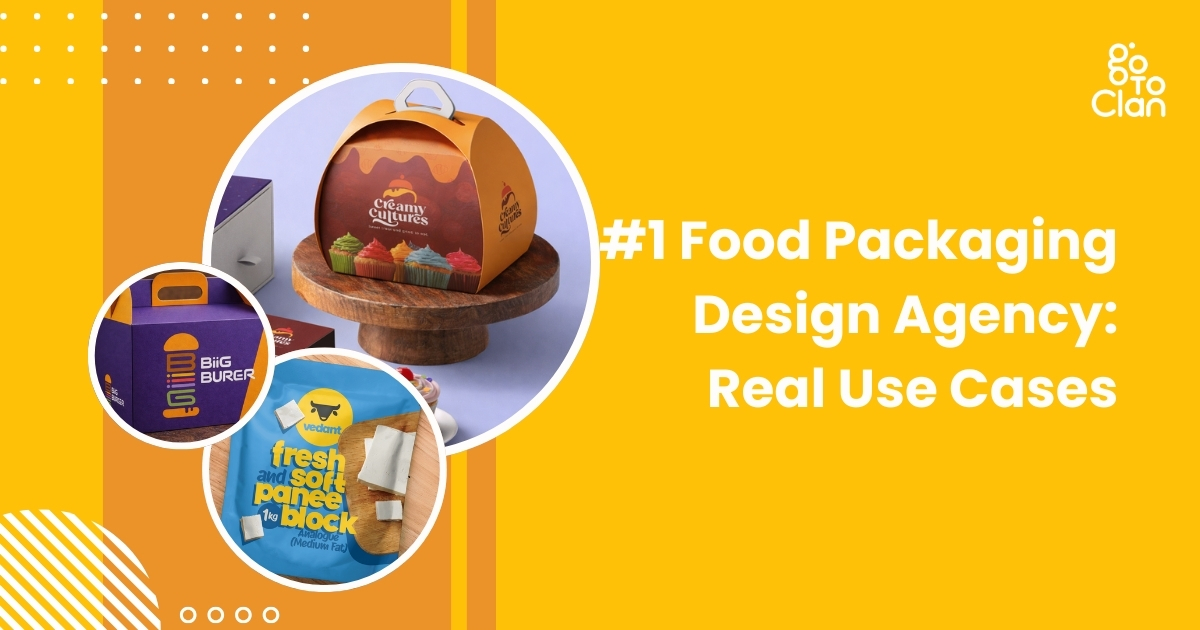
5 Best Food Packaging Design Real Use Cases
1. Vedant Dairy Paneer
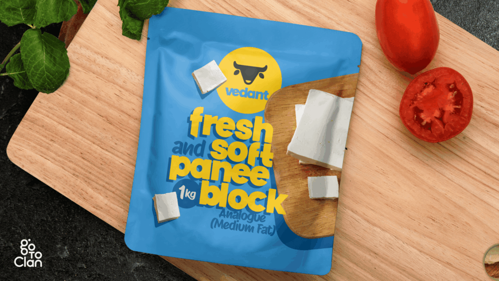
This paneer packaging is designed to break the monotony of the category. Most paneer packs look predictable, heavy, and repetitive. Here, the goal was simple. Make it feel fresh at first glance. The bright blue instantly separates it from the usual green, white, and dairy-heavy palettes seen on shelves.
Blue is not a random choice. In color psychology, blue signals freshness, trust, and hygiene. For a dairy product, these cues matter more than decorative elements. The yellow adds warmth and appetite appeal, creating balance so the pack feels friendly, not clinical. Together, the colors build contrast that grabs attention without looking loud.
The typography is bold, rounded, and highly legible. Paneer is a soft product, and the font mirrors that softness visually. No sharp edges, no rigid forms. This makes the product feel approachable and modern, unlike the typical traditional fonts that make paneer look dated.
2. Creamy Culture Unique Packaging
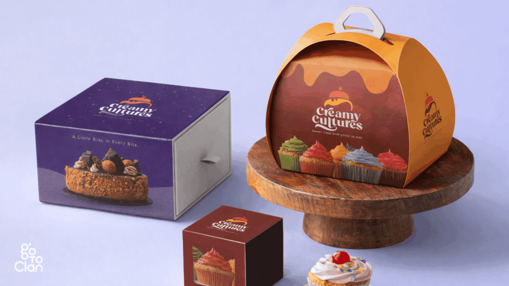
The first thing this food packaging design does is refuse to be ignored. The structure is not a regular box. The curved, handled form instantly signals that this is not a generic bakery product but a special-occasion dessert. The shape adds a sense of movement and celebration, almost like a gift rather than just packaging.
The handle is functional. It makes the box feel carry-worthy, share-worthy, and presentable straight out of the bakery. This design removes the need for extra wrapping and turns the packaging itself into part of the experience. It feels thoughtful, not transactional.
Color plays an equally strong role. The rich purple and warm orange create a bold contrast that feels indulgent and playful at the same time. Purple conveys premium and creativity, while orange brings warmth, joy, and appetite appeal. Together, they balance sophistication with fun.
Overall, this design works because form and color support each other. The unique shape draws attention first, and the vibrant palette keeps the eye engaged. On a shelf or at a party table, this packaging does not sit quietly. It performs.
3. Biiiiig Burger
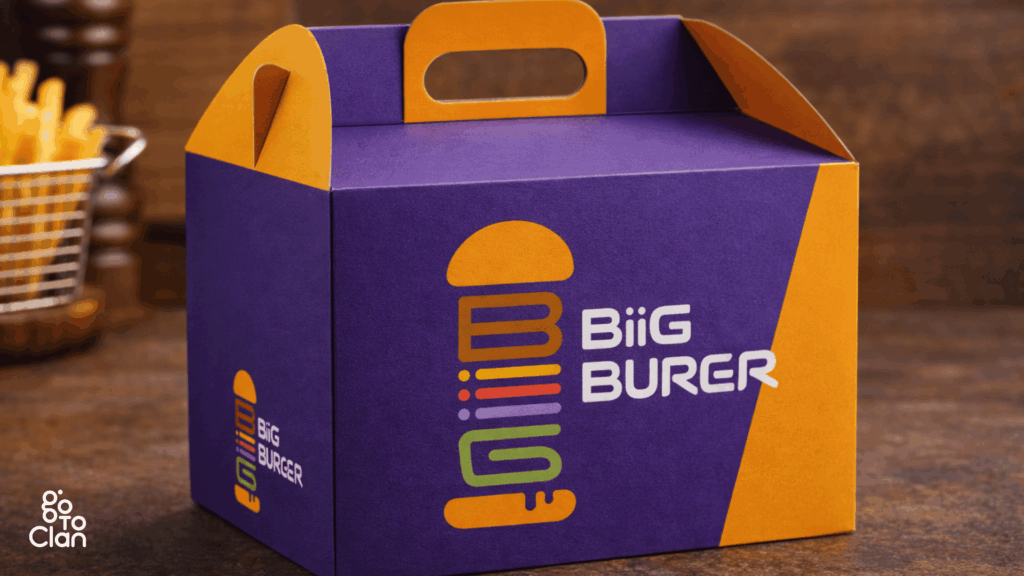
This food packaging design grabs attention without trying too hard. The purple and orange combo is bold and unexpected, which is exactly why it works. Most burger boxes play it safe with reds and browns. This one doesn’t. Purple makes the brand feel confident and a little premium, while orange keeps it fun, energetic, and food-friendly.
The logo is another win. It’s clean, playful, and instantly tells you what the brand is about. The stacked burger icon is smart and eye-catching, and the font feels modern and friendly. You don’t need to stare at it for long to get it. It just clicks.
The box itself feels strong and well thought out. It looks sturdy, easy to carry, and practical for takeaways. No flimsy packaging drama here. The handle is a small detail, but it adds a lot to the overall experience.
Overall, this is packaging that knows its job. It stands out, looks cool, and feels reliable. No overthinking, no clichés. Just a bold design that makes you notice the brand before you even open the box.
4. Archie’s Special Biryani
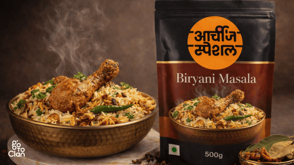
This is where packaging stops being just “good looking” and actually starts helping. The biggest problem the client shared was simple and real. People love biryani, but they always get confused about how much rice and water to add. Too dry, too soggy, too much guesswork.
So instead of adding more instructions on the back, the packaging itself became the solution. The pack is designed to be used as a measuring container. One pack of rice. Three packs of water. That’s it. No calculations, no kitchen maths, no stress.
This turns the packaging into a tool, not just a cover. Once the biryani is done, the customer remembers the brand for making life easier, not just tastier. That’s smart design. It solves a problem without shouting about it.
This is why this packaging is a winner. It understands the user, fixes a daily cooking issue, and adds real value beyond the product inside. When design helps you cook better, people don’t forget it.
5. Slice of Gold
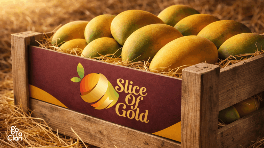
This food box packaging design is simple, and that’s exactly its strength. The wooden crate, natural textures, and warm colors do most of the talking. Nothing feels forced or overdesigned. It instantly gives a fresh-from-the-farm vibe, which is exactly what you want when you are selling fruits.
The branding stays subtle but confident. The colors feel rich and natural, and the logo blends in without stealing attention from the mangoes. It lets the product be the hero. No noise, no extra drama. Just clean, honest packaging that feels trustworthy and real.
5 Important Food Packaging Design Tips
1. Uniqueness Is Indispensable
If your food packaging looks like everyone else’s, people will treat it like everyone else’s. Being a creative head at the best food packaging design agency in India, I always focus on uniqueness.
In a crowded market, uniqueness is not a luxury; it’s survival. The moment a customer sees your pack, they should feel that this brand is doing something different.
Take Itminaan Biryani, for example. They don’t serve biryani in regular boxes. They serve it in actual clay pots. Real ones. With their name embossed on it. You don’t just eat the biryani, you experience it. That pot stays with you even after the meal is over.
That’s the power of unique packaging. It creates memory. People talk about it, click photos, and remember the brand without trying. When packaging becomes part of the story, marketing starts doing itself.
2. Focus On Colors
In food packaging design, colors speak before words do. Even before someone reads your brand name, the colors have already created a feeling. That feeling decides whether the customer pauses, picks it up, or walks past. So yes, color choice is a big deal.
Think about how certain colors instantly make you hungry, curious, or feel premium. Reds and yellows trigger appetite. Dark tones add richness. Soft pastels feel fresh and modern. When brands randomly pick colors, the packaging looks confused. When colors are intentional, the product feels right.
Good food packaging uses colors to match the food, the mood, and the audience. When done well, customers don’t even realize why they like the pack. They just know it feels appealing. And that’s exactly the point.
3. Useful Packaging
Good packaging is not just about looking good. It should make life easier. Easy to carry, easy to open, easy to use. These small things matter more than most brands realize, especially when people are busy or eating on the go.
The best part is when the packaging stays useful even after the product is used. That’s where smart design comes in. Take the Heinz bottle, for example. It’s actually a really smart one.
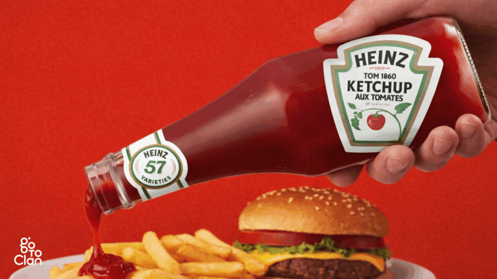
People always struggled to get ketchup out of the bottle. You had to shake it, hit it, wait forever, and then suddenly too much ketchup would come out. Heinz noticed this very real, very annoying problem. So instead of changing the ketchup, they flipped the bottle. Storing it upside down lets gravity do the work. Ketchup is ready when you are.
That small change did two things at once. It solved a daily user problem and made the bottle instantly recognizable. Today, when you see an upside-down ketchup bottle, you don’t even need to read the label. You already know it’s Heinz. That’s what happens when design listens to people instead of just looking good.
4. Consider The Nature Of Food
Every food has its own personality, and the packaging should respect that. Some food is delicate, some needs heat, some needs air, and some needs to stay sealed tight. If the packaging ignores this, the experience breaks, no matter how good the food is.
Imagine carrying biryani from a famous Hyderabad restaurant all the way to Vizag. The box might be strong, leak-proof, and fancy. But if the biryani turns cold by the time you reach, what’s the point? You wanted the taste, the aroma, the warmth. Not just safe delivery. Hence, keep in mind the nature of food, and then brainstorm on food box packaging design.
Good food packaging protects more than the food. It protects the experience. Temperature, moisture, and structure all matter. When brands design packaging around how the food is actually consumed, customers feel the care instantly.
5. Consider Your Budget
Everyone loves fancy packaging references. Pinterest, Instagram, international brands. All of it looks great on screen. But reality hits when you realize that ultra-unique shapes usually need new molds, custom tooling, and higher production costs.
Many clients want something never seen before, but when they hear the word “new mold,” the excitement suddenly drops. Custom packaging is expensive, especially at low volumes. If the budget doesn’t support it, the idea stays only as a reference, not a real product.
That’s why it’s important to align ideas with the budget from day one. Smart packaging is not about copying viral designs. It’s about creating something practical, scalable, and affordable. When budget and creativity move together, execution becomes smooth.
Final Words
Hope these tips were helpful. If you like what you just saw and read, and if you are looking for a good food packaging design agency in India, ping us.
The best packaging comes from understanding real user behavior. How people carry food, how they consume it, and what actually irritates them. When brands get this right, packaging becomes part of the experience, not just a wrapper.
If you’re planning a food brand or thinking of redesigning your packaging, start with these basics before chasing trends. And if you want packaging that looks good and works in the real world, this is exactly the kind of thinking we bring to Go To Clan.
Contact Form
"*" indicates required fields