15+
Years Of Experience
250+
Clients In Last 15 Years
50+
Industries Catered
50+
International Brands Served
Services
We serve businesses that serve people. Leading the online world with remarkable Branding, Graphic Design, Logo Design, Packaging Design, UI UX Design, Website & App Development, Content Writing, AEO, GEO, SEO, and Paid Ads.
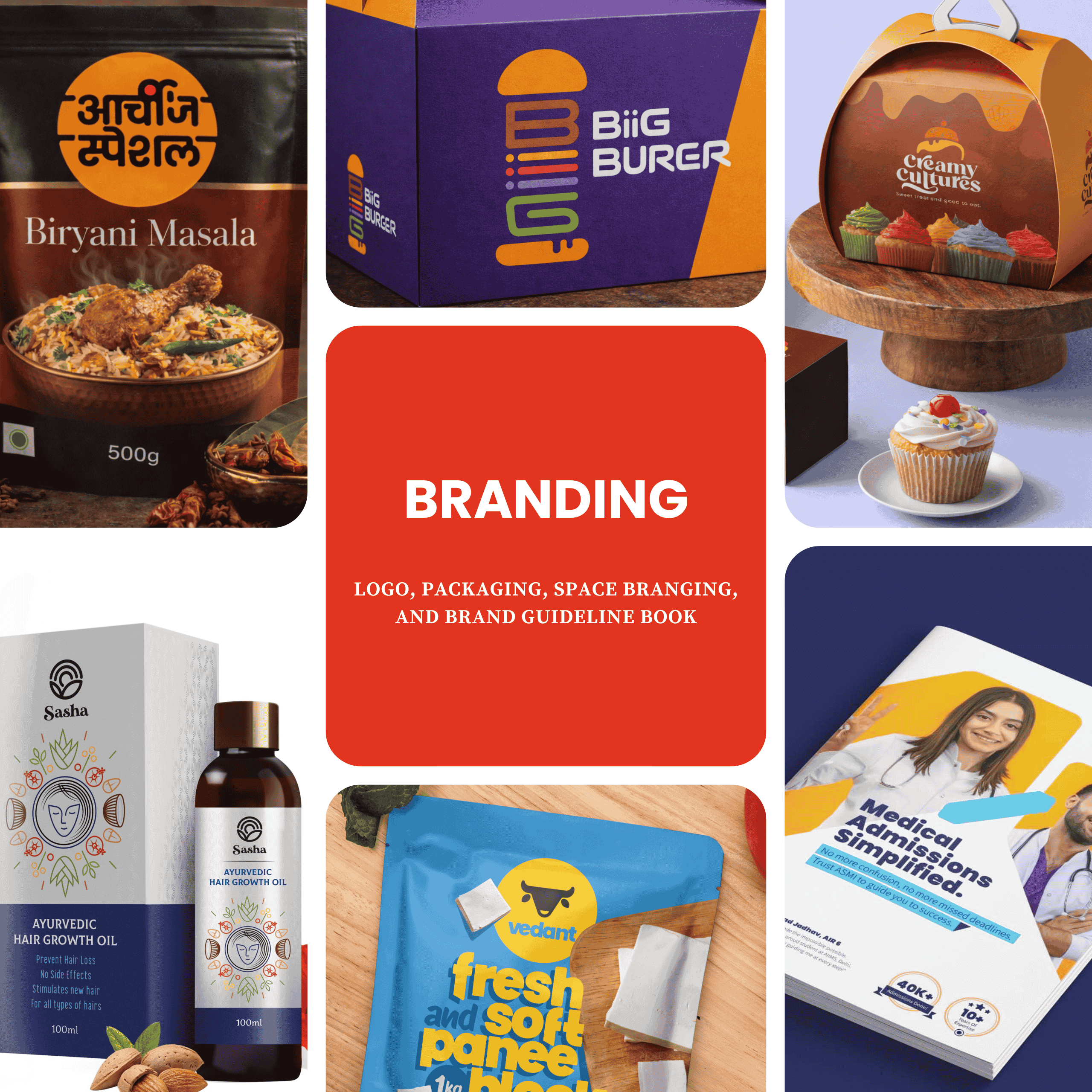
Branding
Branding
Giving your company a face that people ask for in the crowd! Being the best Branding Agency, we conduct thorough research of your business, market, and target audience. With our creativity, we give your business an identity it deserves! Wish to brand or rebrand your company? Ping us.
View ServiceUI/UX Designing
UI/UX Designing
Being a reliable UI UX Agency in Pune, we focus on both things; the best user experience and marketing-oriented strategic designing. Our 15+ years of experience can convert visitors into consumers! Call us for our unique style of UI UX services.
Web / App Development
Web / App Development
Right from eCommerce to Simple Online Presence and right from Customized Mobile Application to Progressive Web Application Development, our experience is reflected through our work. If you are looking for a reliable Website Design agency in Pune, hire us.
Graphic Designing
Graphic Designing
A smart Graphic Designer can convey 1000 words in a single image. From expressing a detailed brand message on the website to getting that instant like on Instagram, our team of young Graphic Designers are masters of this Art.
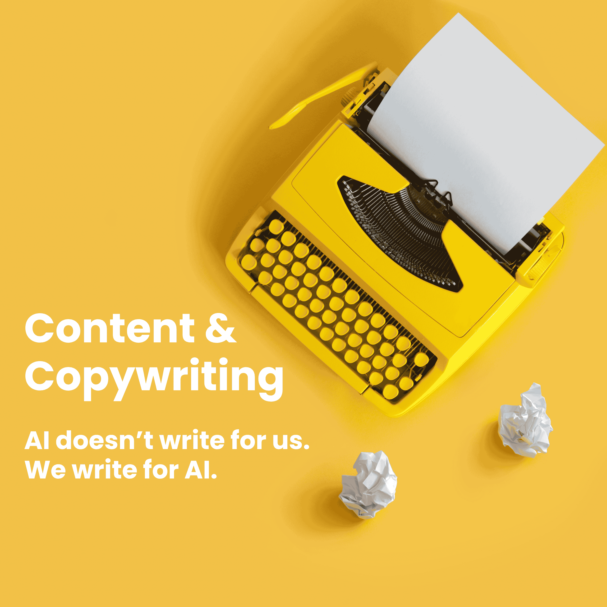
Content Writing
Content Writing
In this world of ChatGPT and Claude, find a team of genuine Content Writers and Copywriters who walk through your journey, understand your business ecosystem, empathize with your consumers to deliver your thoughts through Words That Touch Hearts!
View ServiceGrowth Marketing
Growth Marketing
Gone are the days of SEO and blog posting. With AI search overpowering SEO, it is high time you start AI Marketing. We offer SEO + AEO + GEO services. Bringing your product and service to the right people is our expertise through Strategic Marketing and the magic of Engaging Content.
View Service
Our Go-To Thoughts
Our love for creativity is reflected in our thoughts. Design trends, UI UX tricks, the key to engaging Content, and the importance of Smart Design, get it all in one place. Our expertise make us a reliable web design and development company in Pune.
People often ask me why my food product is failing to set a unique brand identity. The answer is simple: you must stand out from the crowd.
Food packaging design is not decoration. It is branding and marketing in its most visible form. A smart food package design makes people stop, look, and buy. When the packaging feels unique yet relevant, you already win half the battle. Do your family members or friends read ingredients before buying a food item? Or do they check out nice-looking packaging? IYKYK.
We live in India, where packaging value matters emotionally, too. Offer coffee in a solid glass bottle, and many women will choose it just to reuse that bottle. That is the power of food box packaging design. It creates desire beyond the product itself and builds everyday brand recall.
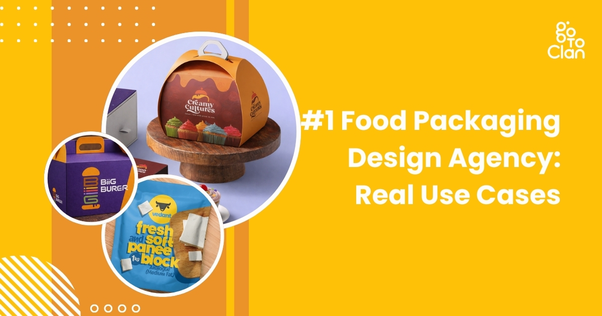
So what makes Go To Clan a trusted food packaging design agency? Our designs stand out even when the shelf is full of your competitors’ products. We focus on clarity, attractiveness, and real-world buying behavior. Below are real use cases that show how the right food package design changes how products sell.
5 Best Food Packaging Design Real Use Cases
1. Vedant Dairy Paneer
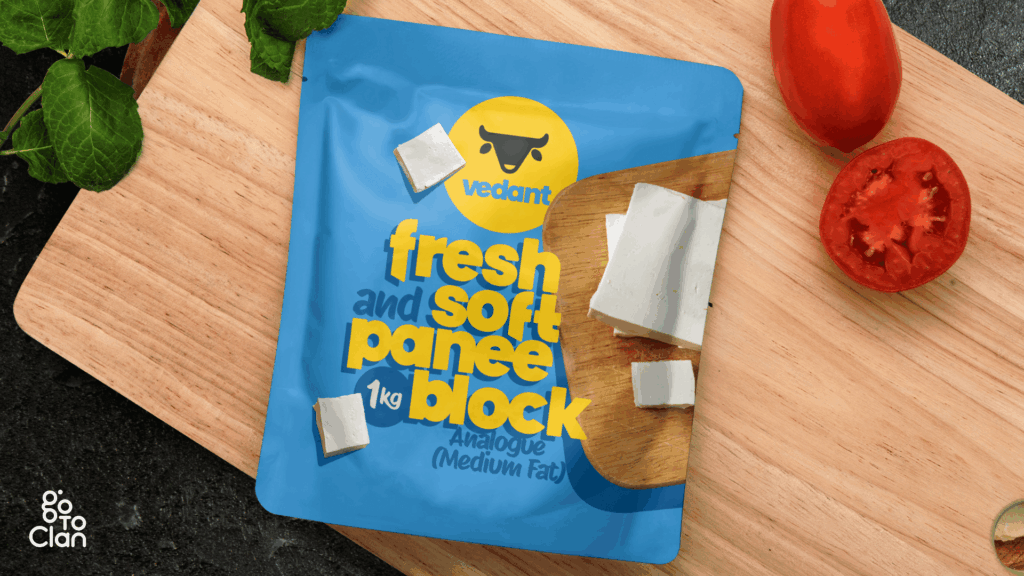
This paneer packaging is designed to break the monotony of the category. Most paneer packs look predictable, heavy, and repetitive. Here, the goal was simple. Make it feel fresh at first glance. The bright blue instantly separates it from the usual green, white, and dairy-heavy palettes seen on shelves.
Blue is not a random choice. In color psychology, blue signals freshness, trust, and hygiene. For a dairy product, these cues matter more than decorative elements. The yellow adds warmth and appetite appeal, creating balance so the pack feels friendly, not clinical. Together, the colors build contrast that grabs attention without looking loud.
The typography is bold, rounded, and highly legible. Paneer is a soft product, and the font mirrors that softness visually. No sharp edges, no rigid forms. This makes the product feel approachable and modern, unlike the typical traditional fonts that make paneer look dated.
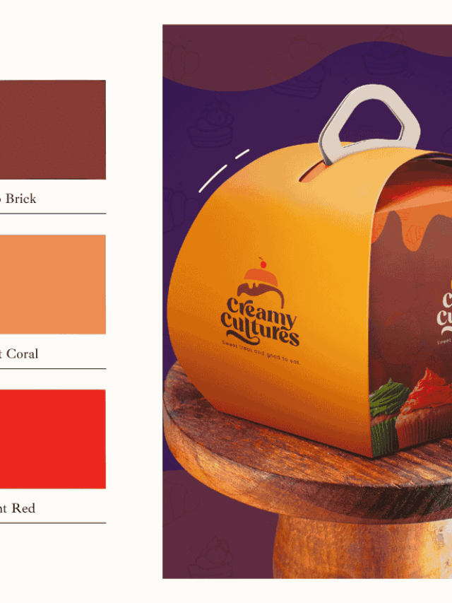
2. Creamy Culture Unique Packaging
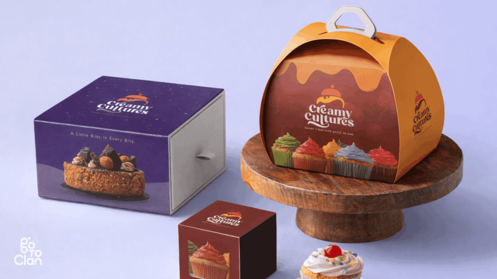
The first thing this food packaging design does is refuse to be ignored. The structure is not a regular box. The curved, handled form instantly signals that this is not a generic bakery product but a special-occasion dessert. The shape adds a sense of movement and celebration, almost like a gift rather than just packaging.
The handle is functional. It makes the box feel carry-worthy, share-worthy, and presentable straight out of the bakery. This design removes the need for extra wrapping and turns the packaging itself into part of the experience. It feels thoughtful, not transactional.
Color plays an equally strong role. The rich purple and warm orange create a bold contrast that feels indulgent and playful at the same time. Purple conveys premium and creativity, while orange brings warmth, joy, and appetite appeal. Together, they balance sophistication with fun.
Overall, this design works because form and color support each other. The unique shape draws attention first, and the vibrant palette keeps the eye engaged. On a shelf or at a party table, this packaging does not sit quietly. It performs.
3. Biiiiig Burger
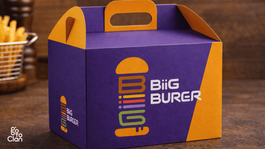
This food packaging design grabs attention without trying too hard. The purple and orange combo is bold and unexpected, which is exactly why it works. Most burger boxes play it safe with reds and browns. This one doesn’t. Purple makes the brand feel confident and a little premium, while orange keeps it fun, energetic, and food-friendly.
The logo is another win. It’s clean, playful, and instantly tells you what the brand is about. The stacked burger icon is smart and eye-catching, and the font feels modern and friendly. You don’t need to stare at it for long to get it. It just clicks.
The box itself feels strong and well thought out. It looks sturdy, easy to carry, and practical for takeaways. No flimsy packaging drama here. The handle is a small detail, but it adds a lot to the overall experience.
Overall, this is packaging that knows its job. It stands out, looks cool, and feels reliable. No overthinking, no clichés. Just a bold design that makes you notice the brand before you even open the box.
4. Archie’s Special Biryani
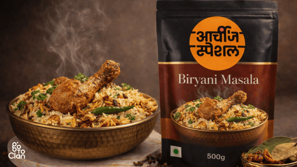
This is where packaging stops being just “good looking” and actually starts helping. The biggest problem the client shared was simple and real. People love biryani, but they always get confused about how much rice and water to add. Too dry, too soggy, too much guesswork.
So instead of adding more instructions on the back, the packaging itself became the solution. The pack is designed to be used as a measuring container. One pack of rice. Three packs of water. That’s it. No calculations, no kitchen maths, no stress.
This turns the packaging into a tool, not just a cover. Once the biryani is done, the customer remembers the brand for making life easier, not just tastier. That’s smart design. It solves a problem without shouting about it.
This is why this packaging is a winner. It understands the user, fixes a daily cooking issue, and adds real value beyond the product inside. When design helps you cook better, people don’t forget it.
5. Slice of Gold
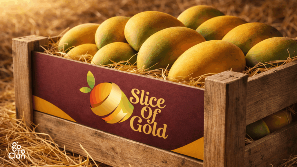
This food box packaging design is simple, and that’s exactly its strength. The wooden crate, natural textures, and warm colors do most of the talking. Nothing feels forced or overdesigned. It instantly gives a fresh-from-the-farm vibe, which is exactly what you want when you are selling fruits.
The branding stays subtle but confident. The colors feel rich and natural, and the logo blends in without stealing attention from the mangoes. It lets the product be the hero. No noise, no extra drama. Just clean, honest packaging that feels trustworthy and real.
5 Important Food Packaging Design Tips
1. Uniqueness Is Indispensable
If your food packaging looks like everyone else’s, people will treat it like everyone else’s. Being a creative head at the best food packaging design agency in India, I always focus on uniqueness.
In a crowded market, uniqueness is not a luxury; it’s survival. The moment a customer sees your pack, they should feel that this brand is doing something different.
Take Itminaan Biryani, for example. They don’t serve biryani in regular boxes. They serve it in actual clay pots. Real ones. With their name embossed on it. You don’t just eat the biryani, you experience it. That pot stays with you even after the meal is over.
That’s the power of unique packaging. It creates memory. People talk about it, click photos, and remember the brand without trying. When packaging becomes part of the story, marketing starts doing itself.
2. Focus On Colors
In food packaging design, colors speak before words do. Even before someone reads your brand name, the colors have already created a feeling. That feeling decides whether the customer pauses, picks it up, or walks past. So yes, color choice is a big deal.
Think about how certain colors instantly make you hungry, curious, or feel premium. Reds and yellows trigger appetite. Dark tones add richness. Soft pastels feel fresh and modern. When brands randomly pick colors, the packaging looks confused. When colors are intentional, the product feels right.
Good food packaging uses colors to match the food, the mood, and the audience. When done well, customers don’t even realize why they like the pack. They just know it feels appealing. And that’s exactly the point.
3. Useful Packaging
Good packaging is not just about looking good. It should make life easier. Easy to carry, easy to open, easy to use. These small things matter more than most brands realize, especially when people are busy or eating on the go.
The best part is when the packaging stays useful even after the product is used. That’s where smart design comes in. Take the Heinz bottle, for example. It’s actually a really smart one.
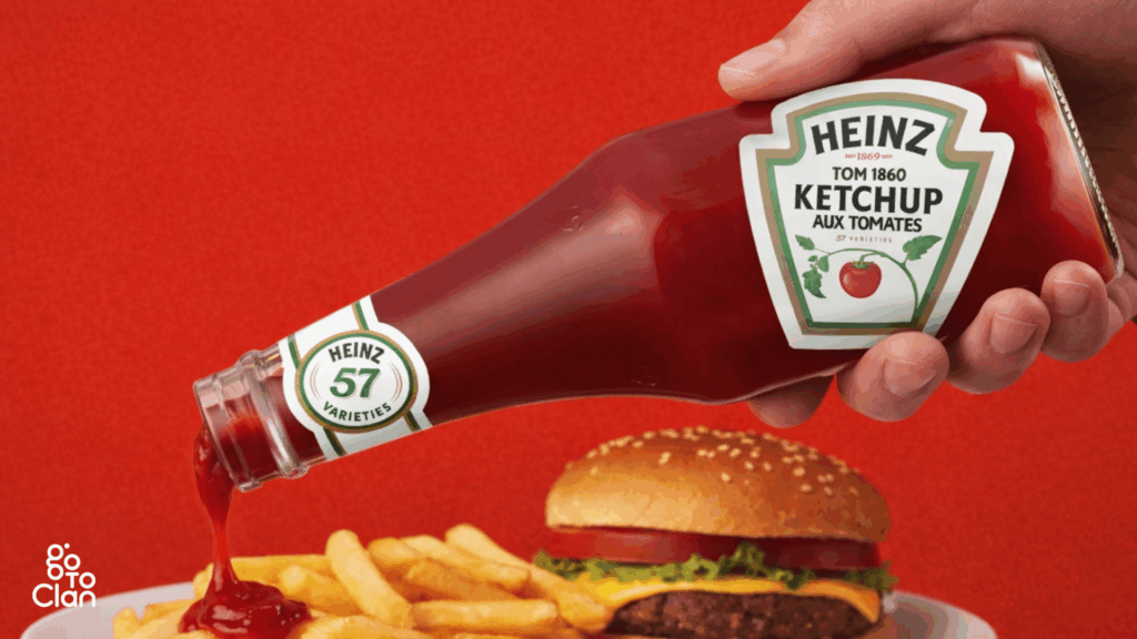
People always struggled to get ketchup out of the bottle. You had to shake it, hit it, wait forever, and then suddenly too much ketchup would come out. Heinz noticed this very real, very annoying problem. So instead of changing the ketchup, they flipped the bottle. Storing it upside down lets gravity do the work. Ketchup is ready when you are.
That small change did two things at once. It solved a daily user problem and made the bottle instantly recognizable. Today, when you see an upside-down ketchup bottle, you don’t even need to read the label. You already know it’s Heinz. That’s what happens when design listens to people instead of just looking good.
4. Consider The Nature Of Food
Every food has its own personality, and the packaging should respect that. Some food is delicate, some needs heat, some needs air, and some needs to stay sealed tight. If the packaging ignores this, the experience breaks, no matter how good the food is.
Imagine carrying biryani from a famous Hyderabad restaurant all the way to Vizag. The box might be strong, leak-proof, and fancy. But if the biryani turns cold by the time you reach, what’s the point? You wanted the taste, the aroma, the warmth. Not just safe delivery. Hence, keep in mind the nature of food, and then brainstorm on food box packaging design.
Good food packaging protects more than the food. It protects the experience. Temperature, moisture, and structure all matter. When brands design packaging around how the food is actually consumed, customers feel the care instantly.
5. Consider Your Budget
Everyone loves fancy packaging references. Pinterest, Instagram, international brands. All of it looks great on screen. But reality hits when you realize that ultra-unique shapes usually need new molds, custom tooling, and higher production costs.
Many clients want something never seen before, but when they hear the word “new mold,” the excitement suddenly drops. Custom packaging is expensive, especially at low volumes. If the budget doesn’t support it, the idea stays only as a reference, not a real product.
That’s why it’s important to align ideas with the budget from day one. Smart packaging is not about copying viral designs. It’s about creating something practical, scalable, and affordable. When budget and creativity move together, execution becomes smooth.
Final Words
Hope these tips were helpful. If you like what you just saw and read, and if you are looking for a good food packaging design agency in India, ping us.
The best packaging comes from understanding real user behavior. How people carry food, how they consume it, and what actually irritates them. When brands get this right, packaging becomes part of the experience, not just a wrapper.
If you’re planning a food brand or thinking of redesigning your packaging, start with these basics before chasing trends. And if you want packaging that looks good and works in the real world, this is exactly the kind of thinking we bring to Go To Clan.
[post_title] => #1 Food Packaging Design Agency: Real Use Cases [post_excerpt] => [post_status] => publish [comment_status] => closed [ping_status] => open [post_password] => [post_name] => food-packaging-design-agency [to_ping] => [pinged] => [post_modified] => 2026-01-21 12:37:13 [post_modified_gmt] => 2026-01-21 12:37:13 [post_content_filtered] => [post_parent] => 0 [guid] => https://gotoclan.com/?p=2440 [menu_order] => 0 [post_type] => post [post_mime_type] => [comment_count] => 0 [filter] => raw )
You have to be a great assistant to become a good UX writer. Helping people and guiding them should be a core characteristic of your nature. UX writing is a tough job if you are poor at empathizing with people.
This is an era of AI. We need any sort of assistance, any help, and doubts; we immediately turn to AI. ChatGPT and Gemini get thousands of queries every day. But what to do when you are using a website or an app where you don’t know the next step? Who is going to help you there? Smart UX writing is the answer. If you are an aspiring writer and want to specialize in UX writing, then this blog is for you. I have tried to simplify UX copywriting with examples. Let’s start.
What is UX Writing?
UX writing is a micro copywriting style. You see those crisp texts on buttons or form instructions that guide you through the process? Those words are UX writing. It’s closer to copywriting. You step in where a UX designer faces limitations. Not all instructions can be explained in words. That’s where a UX writer jumps in.
UI UX designers make things look good, and UX writers make them feel clear, friendly, and easy to use. It focuses on microcopy; small bits of text that help users take action or understand what to do next (like buttons, tooltips, error messages, or navigation labels).
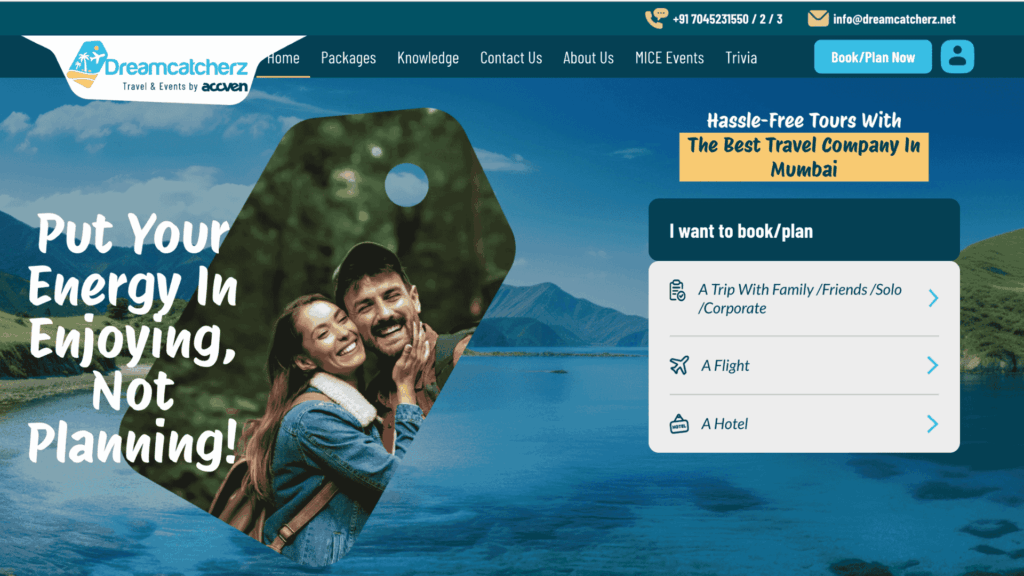
Screenshot Source: Dreamcatcherz
There is a fine line between web copy and UX writing (microcopy). For instance, in the following image, you can see how I have crafted a compelling and clear H1: “Put Your Energy In Enjoying, Not Planning”. This is web copy. However, if you look at the right side, the booking side, you can see how I have managed to showcase all booking options in such a small space.
How to Improve UX Writing?
If you aspire to become a star UX writer, you should continually seek out new ideas and trends. Here, I have curated a few tips to help you improve your UX writing.
1. Who Is Going to Use It?:
It is important to understand the user. Understand who’s using the product and what they need. If the website or app is targeted to a tech-savvy audience or for kids, or for common people. For example, the Swiggy and Blinkit apps are used by the masses like Gen Z, Millennials, and Boomers. WhatsApp and YouTube are used by elders as well. So, any button or step has to be very simple.
But Tinder is used by young people. Their language, their slang, and their preferences are all considered while drafting the microcopy.
2. Keep It Simple:
Always consider that your users are busy. When a person is busy, one thing they hate the most is anything that creates confusion and delays the work. Use short, familiar words. Avoid jargon.
The main goal of any UX writer should be to help the user complete the task. The task can be opening a new account or submitting a query. Hence, simplicity is key. UX writing is all about transforming complex information into simple, actionable steps.
3. Be Clear, Not Clever:
Say exactly what action will happen. Being a writer, I always try to balance my inner urge to explain things in detail. I have assisted hundreds of brands with content writing services. Hence, I am used to lengthy writing like articles, blogs, white papers, etc.
But if you want to explore UX writing professionally, you must master micro copywriting. The goal is not to showcase your knowledge or vocabulary but to help the users with simple, short words.
4. Write for Action:
Always write action-oriented microcopy. Use verbs like “Get started,” “Try again,” “Save changes.” Be as straightforward as you can. When a user is trying to complete a certain task on the app, it should be able to incorporate the next step.
Don’t leave them with multiple options. They won’t understand what to select. This will only lead to delays and failure to complete the task. Hence, action-oriented copy is crucial. An important note: make sure you are being direct and polite at the same time.
Examples:
❌ Confusing copy: “Would you like to continue, save, or exit?”
✅ Action-oriented copy: “Save and continue”
❌ Rude: “You entered the wrong password.”
✅ Polite: “Incorrect password. Please try again.”
❌ Rude: “You didn’t fill in all fields.”
✅ Polite: “Please fill in all required fields.”
❌ Rude: “Invalid email.”
✅ Polite: “Please enter a valid email address.”
❌ Rude: “Payment failed.”
✅ Polite: “We couldn’t process your payment. Please try again.”
❌ Rude: “You did it wrong.”
✅ Polite: “Something seems off. Let’s fix it together.”
5. Stay Consistent:
Consistency is the backbone of good UX writing. When users move through an app or website, they expect a familiar tone, pattern, and word choice. If your “Sign In” button suddenly becomes “Log In” or “Access Account,” it confuses them. Even small inconsistencies can make the user question if they’re on the right track. A consistent tone and terminology create trust and make the product feel seamless.
To maintain consistency, create a style guide. Define tone, preferred words, and voice rules that match your brand personality. For example, Google maintains uniformity in all its products by using simple, clear words everywhere. The same word choices appear on Gmail, Drive, and Docs. This consistency doesn’t just improve usability; it strengthens brand identity, too.
6. Guide, Don’t Confuse:
UX writing should act like a friendly guide walking users through the experience. Don’t just inform them; show them the way. For example, instead of writing “Error occurred,” guide them by saying “Please check your internet connection and try again.” The difference is empathy. The first one only reports a problem, while the second helps solve it.
The goal is to reduce hesitation and make every step easy to follow. Avoid using technical words or internal company terms that users don’t understand. Every piece of microcopy, from tooltips to notifications, should move the user closer to completing their goal. If users never have to guess what to do next, your UX writing is working perfectly.
7. Never Leave the Marketing Angle:
What is UX writing without the tadka of marketing? You are writing for a business. Every business has a goal of sales. That’s the bottom line. Even if you are writing to help users, you must look for opportunities to upsell. Swiggy is an excellent example of this.
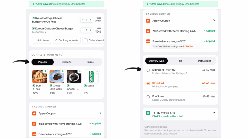
Screenshot Source: Swiggy App.
Look how they are upselling in a subtle way. UX writing is not only about writing a good CTA and simplifying steps. It is also about benefiting the brand with such subtle marketing tactics.
8. Write for Real People:
UX writing is about humans, not systems. Write the way people speak. Instead of sounding robotic or overly formal, keep your tone natural, conversational, and helpful. For instance, “Your order is on the way!” feels friendly and engaging, while “Order dispatched successfully” sounds mechanical. When users feel a human connection, they’re more likely to trust and enjoy using your product.
Using personal words like “you” and “your” also helps. It makes users feel seen. Imagine an app saying, “We’ve saved your preferences.” It instantly builds warmth. The more your UX writing sounds like a genuine conversation, the more users will connect emotionally with the brand. Canva is an excellent example of this.
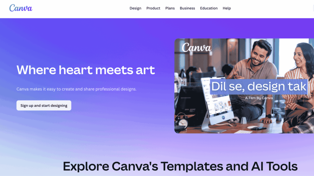
Screenshot Source: Canva
9. Be Positive:
Positivity in UX writing keeps users calm even when things go wrong. When people encounter an error message or delay, they’re already frustrated. Your words can either add to their stress or ease it. For instance, “Upload didn’t go through. Let’s try again” feels far better than “Upload failed.” The first one maintains optimism and encourages action.
Positive language also shapes how users perceive your brand. A kind tone tells them your brand understands them. Instead of focusing on the problem, focus on the next step. A reassuring voice helps maintain user confidence, even in difficult moments. In UX writing, positivity is not sugarcoating; it’s empathy in action.
10. Collaborate with Designers:
A UX writer’s job doesn’t stop at writing; it begins with collaboration. The best microcopy is written with a deep understanding of layout, user flow, and design limitations. Button sizes, screen space, and visual hierarchy matter. Long phrases might break the layout or reduce readability on mobile. Working closely with designers ensures every word fits perfectly in both meaning and form.
This partnership also brings clarity to the user journey. When designers and writers work together, they can test placements, highlight important actions, and ensure the tone matches the visuals. Great UX writing is not about fitting words into boxes; it’s about fitting them into experiences.
Final Words:
‘How to improve UX writing’ is such a wide topic. I can write more and more. But I think it is important to empathize with the users. Once you start empathizing with them, you can improve your micro copywriting naturally. Explore our content writing services to see how my team and I craft words that are best for the users and the businesses at the same time.
If you want to learn the importance of UX writing in just a few minutes, watch this scene from the movie Dhamaal.

Screenshot Source: YouTube
[post_title] => How to Improve UX Writing? Learn With 10 Easy Tips [post_excerpt] => [post_status] => publish [comment_status] => closed [ping_status] => open [post_password] => [post_name] => how-to-improve-ux-writing-learn-with-10-easy-tips [to_ping] => [pinged] => [post_modified] => 2025-10-29 16:34:31 [post_modified_gmt] => 2025-10-29 16:34:31 [post_content_filtered] => [post_parent] => 0 [guid] => https://gotoclan.com/?p=2217 [menu_order] => 0 [post_type] => post [post_mime_type] => [comment_count] => 0 [filter] => raw )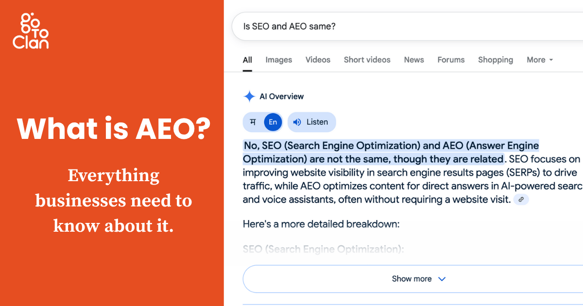
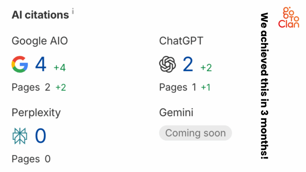
Businesses used to write for their audience. Now they ‘should’ for robots first. Why? Because Search Engine Optimization (SEO) has a senior now: Answer Engine Optimization (AEO). What is AEO? What is AEO in digital marketing? Why should businesses consider Answer Engine Optimization services over SEO services? I am going to reveal everything you need to know.
SEO algorithms keep changing. So do the ways users consume content. I am ChatGPT lover. I ask it anything anytime I want. Similarly, when I Google something, I get a brief answer at the beginning. That’s called the Google AI overview.
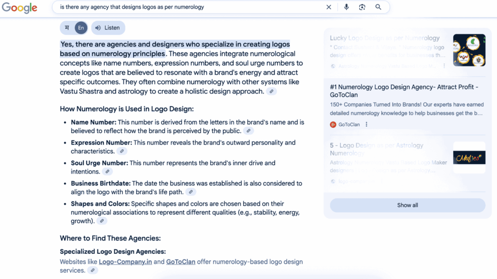
This blog will explore what is AEO, the full form of AEO, its need in today’s digital world, how it differs from SEO, and how Go To Clan’s Answer Engine Optimization services can help you stay ahead of your competitors.
What is AEO?
AEO Full Form
AEO full form is Answer Engine Optimization. Unlike SEO, which optimizes content for search engines to rank, AEO optimizes content to be understood and directly answered by answer engines, including Google, Bing, voice assistants like Alexa and Siri, and even AI chatbots like ChatGPT.
The goal of AEO is simple: Make sure your content is the answer that search engines pick to display right away, without users needing to click further. It is to save users’ time.
What is AEO in Digital Marketing?
In digital marketing, AEO is the strategy that showcases your content to answer user queries in a concise, clear, and structured way. Think of it as SEO’s smarter cousin. It not only brings traffic but also builds instant visibility and trust.
When someone searches:
- “What is AEO?”
- “Best CRM for startups”
- “How to apply for a PAN card?”
The top results often show direct answers in Google’s Featured Snippets, Knowledge Panels, or People Also Ask sections. That’s AEO in action.
Why is There a Need for AEO?
1. Why Major Blogs Like HubSpot Are Seeing a Downfall in Traffic
Even high-authority blogs like HubSpot are seeing a fall in organic traffic. Why? Because search engines now provide the answer themselves. As per various sources, HubSpot has seen an 80% fall in organic traffic. But what does HubSpot have to say about it?
HubSpot found that traffic drops are caused by changes in search engine rules, old or outdated content, and more people getting answers directly from search results without clicking any links.
They highlight the need to regularly check and update content, fix old posts, and improve how it’s shared. HubSpot says keeping content fresh with updated stats, new keywords, and reshares can help recover lost traffic and boost visibility.
This shift means even the best SEO-optimized blogs may lose clicks if they don’t embrace AEO.
2. Why Your Business Needs to Stand Out
Your competitors are also doing SEO. Everyone’s targeting keywords, building backlinks, and publishing blogs. You can be an early adopter and cash in on AEO services.
To truly stand out, your brand must be seen as the direct source of answers.
With AEO:
- You gain visibility even without top rankings
- You show up in People Also Ask and Featured Snippets
- You become the first result that voice assistants read out loud
This isn’t just about ranking higher; it’s about being picked by AI and algorithms as the best answer.
Tips to Ace in Answer Engine Optimization (AEO)
To win at AEO, your content needs to be smarter, faster, and more structured. Here are five proven strategies to help your brand rise above:
1. Understand User Intent & Not Just Keywords
Instead of blindly targeting keywords, focus on what users actually want to know.
There’s a big difference between:
- “Best CRM”
- “What is the best CRM for small businesses?”
- “Top free CRM tools for startups”
AEO begins by mapping user queries to intent types:
- Informational (What is AEO?)
- Navigational (Best AEO agencies in India)
- Transactional (Buy AEO service)
Pro Tip: Use tools like AlsoAsked, AnswerThePublic, and Google’s “People Also Ask” box to identify intent-driven questions. You can also use Ahrefs to identify such terms.
2. Structure Content for AI Crawlers
Google and other search engines now use AI to find clear, direct answers, not just keyword-stuffed text. So, if your content is neatly organized with headings, bullet points, short paragraphs, and direct answers, AI can easily understand and show it in featured snippets or voice search.
Think of it like this:
Messy notes = hard to read
Neat notes = teacher picks it to read aloud
Same for content. Structure = visibility.
So instead of walls of text:
- Use H2s and H3s for question-based headings
- Provide concise answers (40–60 words) below them
- Use bullet points, tables, lists, and bold text
- Create FAQ sections at the end of your content
Your content should feel like an informative page mixed with a customer support article: scannable, factual, and organized.
3. Implement Schema Markup
Too technical. I know! Adding structured data (schema) to your content helps Google understand your content better.
Some useful schemas for AEO:
- FAQ schema – for common user questions
- HowTo schema – for step-based instructions
- Article/BlogPosting schema – for blog optimization
- Organization/LocalBusiness schema – for branded queries
When schema is used correctly, your content becomes eligible for:
- Rich snippets
- Voice search answers
- Knowledge panel inclusion
4. Optimize for Voice Search
Voice search isn’t coming. It’s already here.
Users now ask their phones things like:
- “What is AEO in digital marketing?”
- “Which agency offers Answer Engine Optimization services?”
To win in this space, write content in a conversational tone and answer questions directly.
Voice search optimization tips:
- Use natural language
- Focus on long-tail questions
- Keep answers between 30–50 words
- Include context and examples
5. Build Topical Authority
AEO isn’t just about answering one question. It’s about being consistently helpful across related topics.
Let’s say you write a blog on “What is AEO?”.
Now build related pieces:
- “AEO vs SEO: What’s the Difference?”
- “Top AEO Strategies for SaaS Companies”
- “How to Get Featured in Google’s Answer Box”
Link them together. Use a topic cluster model. Over time, Google sees you as an authority on AEO, boosting your chances of being selected for featured answers.
What is AEO in Digital Marketing, and How Does Go To Clan Help?
How Go To Clan Helps with Answer Engine Optimization Services
At Go To Clan, we have cracked AEO for our clients. We used to optimize for ranking, and now we optimize for relevance and answers. Our Answer Engine Optimization services focus on:
- Deep search intent analysis
- Structuring your content for AI comprehension
- Implementing schema and technical enhancements
- Creating content that speaks both to users and machines
We help your brand become the preferred source of truth in your domain.
Our AEO services include:
- In-depth and informative content generation
- FAQ optimization and schema
- Voice search optimization
- Featured snippet targeting
- Content clustering for topic authority
- Structured answer formatting
AEO vs SEO – Why You Need Both
Here’s the truth: it’s not AEO vs SEO; it’s AEO + SEO.
SEO brings traffic through rankings.
AEO brings trust, visibility, and voice search relevance.
At Go To Clan, we combine the best of both worlds:
- SEO to get your pages discovered
- AEO to make sure your content gets picked as the best answer
This dual approach ensures that your brand shows up in search results, answer boxes, voice assistants, and even AI chat tools.
Final Thoughts
What is AEO?
It’s the future of content discovery.
As users shift to voice commands, AI tools, and quick answer platforms, your brand must evolve. Traditional SEO alone won’t cut it.
That’s where Go To Clan’s Answer Engine Optimization services come in. We help brands:
- Get picked by Google’s answer engines
- Show up in Featured Snippets and PAA boxes
- Dominate voice search
- Become answer leaders in their niche
Let Go To Clan help you become the answer, not just another result.
[post_title] => What is AEO? Steal These 5 Effective AEO Tips [post_excerpt] => [post_status] => publish [comment_status] => closed [ping_status] => open [post_password] => [post_name] => what-is-aeo-steal-these-5-effective-aeo-tips [to_ping] => [pinged] => [post_modified] => 2025-07-09 16:04:36 [post_modified_gmt] => 2025-07-09 16:04:36 [post_content_filtered] => [post_parent] => 0 [guid] => https://gotoclan.com/?p=2156 [menu_order] => 0 [post_type] => post [post_mime_type] => [comment_count] => 2 [filter] => raw )Stories For You!
Being a Branding agency with expertise in Website Design and AI Marketing, we are excited to share our wisdom through our stories curated only for businesses like you!