
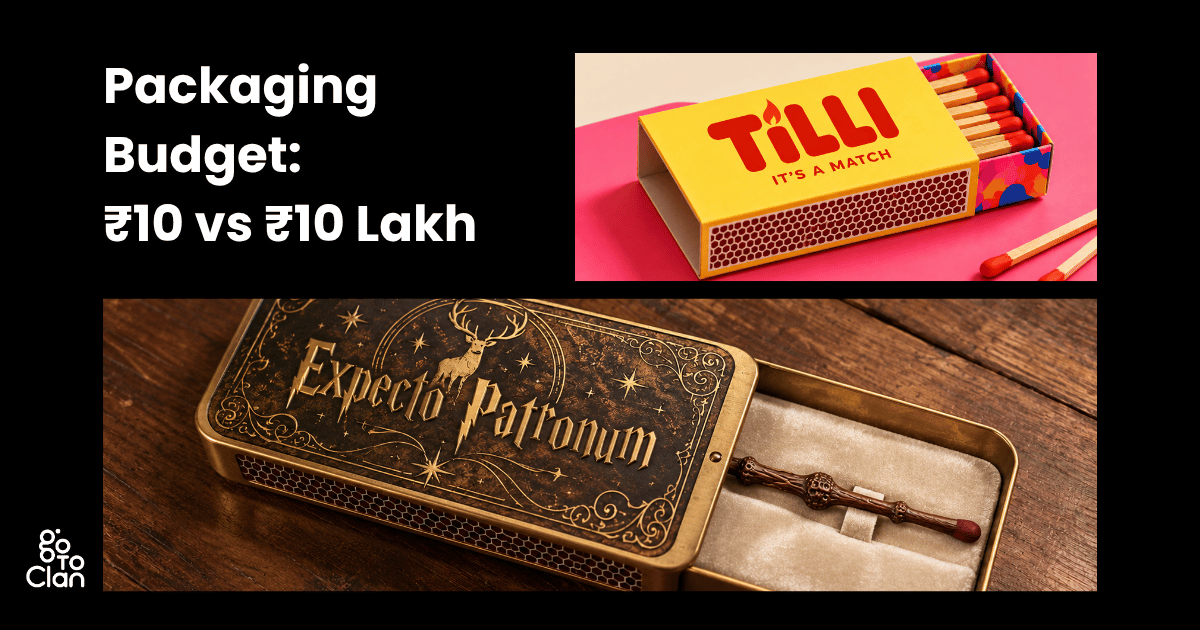
Walk into any kirana store, and you’ll see hundreds of products under ₹10. Matchboxes, biscuits, glue, agarbatti, chaas, mints. Different brands, but somehow, we already know what most of their packaging is going to look like.
But does affordable packaging have to look predictable? We decided to rethink the label and packaging design of some of these everyday products and see how differently they could be presented without changing the product itself.
Then we took the experiment a little too far. What if the product still cost ₹10, but its packaging design had a budget of ₹10 lakh? So, we explored both: smart redesigns for everyday ₹10 products, and what those same products could look like if packaging budgets simply didn’t exist.
Answer Capsule:
What if everyday ₹10 products got a fresh packaging makeover? We experimented with the label and packaging design of matchboxes, cookies, buttermilk, and instant glue. From practical, budget-friendly redesigns to extravagant ₹10 lakh packaging concepts, we explored how creative thinking can transform even the most ordinary products into something memorable.
Label and Packaging Design for ₹10 Products
1. Matchboxes:
Let’s play a game. Be honest. Name 3 matchbox brands in the next 10 seconds. No cheating! 1, 2, 3, 4, …, 10. Tough, right? But if I ask you, what does the typical packaging of an Indian matchbox look like? A few colours that would come to mind are brown and red, some bold yellow font, and the striking strip on the sides.
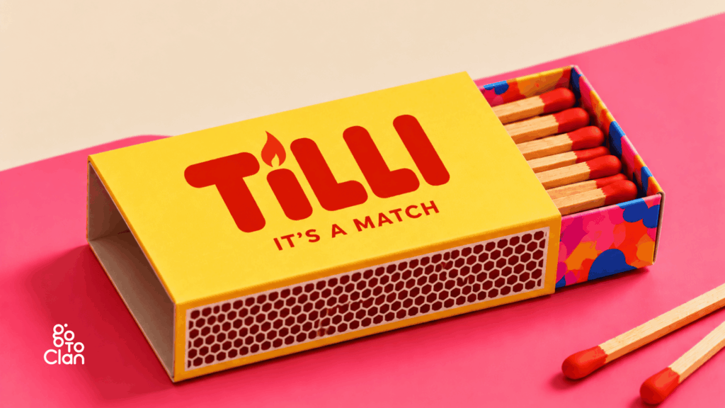
But what if a ₹10 matchbox looked premium without changing the budget? Here is a concept packaging design for a matchbox that looks vibrant, bold, and eye-catching.
What If a ₹10 Matchbox Had Better Packaging?
A matchbox doesn’t have to look boring just because it costs ₹10. For TILLI, we gave the usual packaging design a colourful twist with a bright yellow outer box, playful inner tray, and a simple flame-inspired logo. Even the name plays along with the product, making something as ordinary as a matchbox a little more memorable.
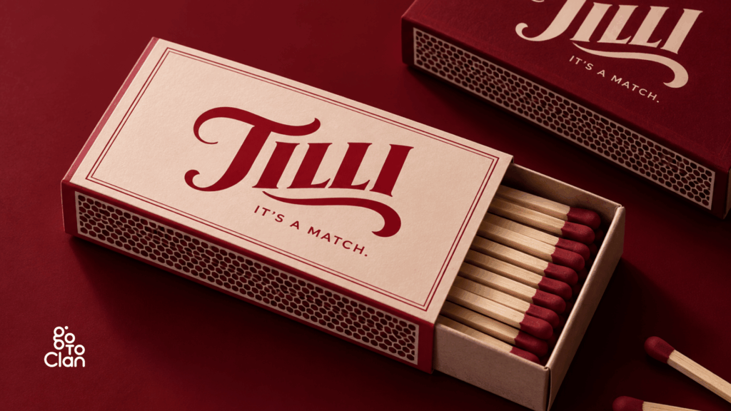
Now, what if the same ₹10 matchbox got a more premium makeover? We kept TILLI, but gave the packaging design a completely different personality with deep reds, warm ivory, and classic typography. The product hasn’t changed, but suddenly, the humble matchbox looks like something you wouldn’t want to throw away.
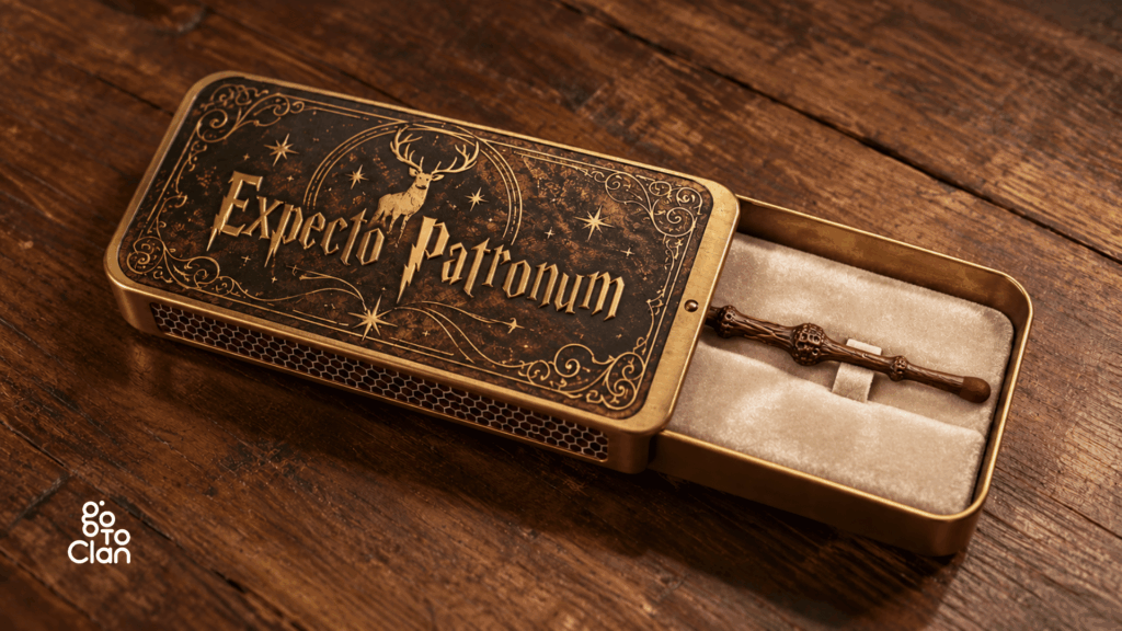
What If a ₹10 Matchbox Had a ₹10 Lakh Packaging Budget?
We at Go To Clan absolutely adore the Harry Potter series. Here is a super-premium single-matchstick box packaging design inspired by the Harry Potter theme. This concept is close to our hearts, as it brings back a little nostalgia.
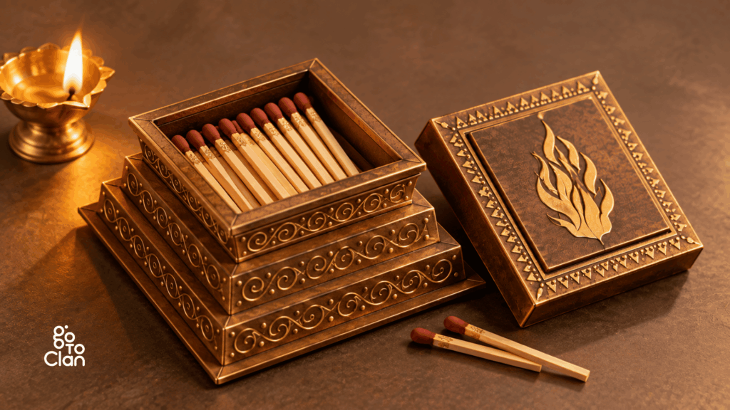
This concept is inspired by traditional Bharatiya culture. A matchstick creates fire, while a havan kund holds the holy fire that has deep cultural and spiritual significance in our traditions. We connected the two and imagined a premium metal matchbox shaped like a havan kund, complete with intricate traditional detailing. And if you look closely, even each matchstick has a delicate golden design, adding another premium touch to the overall packaging design.
2. Cookies
Have you ever noticed how almost every ₹10 biscuit packet follows a similar packaging style? A bright wrapper, a big picture of the biscuits, the brand name in bold letters, and a few ingredients highlighted on the front. Of course, every brand has its own identity, but the basic packaging format remains pretty much the same. And honestly, it makes sense. After all, how much can a brand really experiment with the packaging of a product that costs just ₹10?
But we wanted to see what would happen if we gave these everyday biscuits a fresh identity. So, we picked wheat cookies and created a fictional brand called MauMau. We experimented with its label and packaging design in two ways. First, a practical ₹10 biscuit packet that could easily sit on a supermarket shelf. And second, a ridiculously premium version where we didn’t have to worry about the packaging budget at all.
What If ₹10 Cookies Had Better Packaging?
Meet MauMau! A fun little name we came up with for our wheat cookies. We wanted the brand to feel friendly, fresh, and easy to remember. Something that could appeal to both kids and adults without looking too childish.
For the packaging design, we decided to stick to the familiar biscuit wrapper format. After all, there’s a reason why brands use this kind of pouch packaging. It’s lightweight, convenient, and practical for inexpensive products. But instead of filling the wrapper with too many colours and design elements, we went with warm earthy tones, wheat illustrations, a few green leaves, and a large, playful MauMau logo.
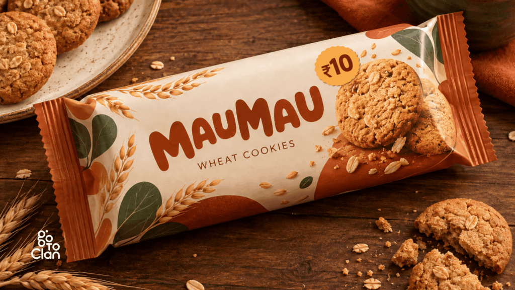
We also added a picture of the cookies on the front so customers could immediately see what they’re buying. And yes, we kept the ₹10 price clearly visible! The idea wasn’t to make an affordable product look unnecessarily expensive. We simply wanted to show how thoughtful FMCG packaging could make even a small packet of wheat cookies look attractive on a crowded store shelf.
What If ₹10 Cookies Had a ₹10 Lakh Packaging Budget?
Okay, now forget everything you know about biscuit packets for a moment. What if we told you that the packaging of your cookies could actually look like a giant cookie?
That’s exactly what we imagined for the premium version of MauMau. Instead of a regular packet or cardboard box, we designed a round cookie container that looks almost good enough to eat! The entire outer surface has a realistic baked-cookie texture, complete with cracks, crumbs, and chunky chocolate pieces.
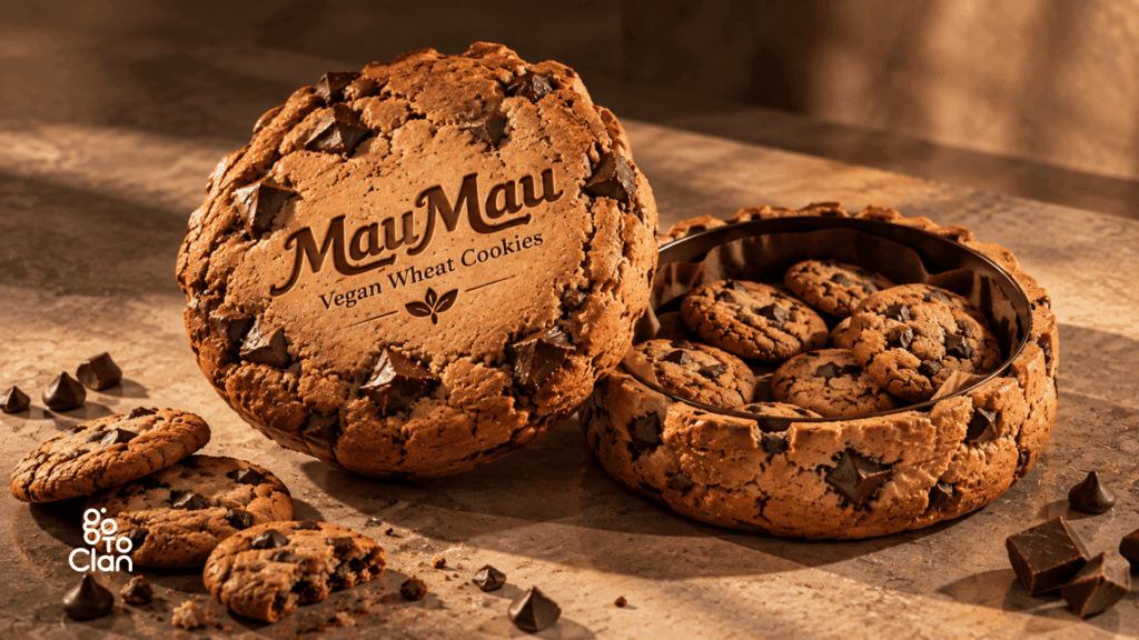
And here’s our favourite detail. We didn’t simply print the MauMau logo on the box. We imagined it carved into the cookie-textured lid, along with the words ‘Vegan Wheat Cookies’. The container opens to reveal a separate compartment filled with actual cookies. So, from the outside, it looks like one giant cookie, but inside, it’s a proper storage box.
Of course, producing something like this for a ₹10 product would make absolutely no financial sense. The materials, detailing, moulding, and production costs would probably be worth several times the biscuits themselves. But that’s the beauty of this experiment. When you remove the budget restrictions from label and packaging design, you can explore ideas that would otherwise never make it past the brainstorming stage.
And imagine receiving this as a gift! You’d probably finish the cookies and still keep the box.
3. Buttermilk (Chaas)
Nothing beats a glass of chilled chaas on a hot Indian afternoon, right? Whether it’s served in a steel glass at home, a matka at a restaurant, or a small tetra pack from a nearby store, buttermilk has always been a part of our everyday lives. But when it comes to packaged chaas, most brands stick to the usual tetra packs with pictures of curd, mint, and jeera. So, we thought, why not experiment with the label and packaging design of something so traditionally Indian? We created a concept brand called Mati and explored three different ways to package the same refreshing drink.
What If ₹10 Chaas Had Better Packaging?
Concept 1: Clean, Fresh, and Minimal
For our first concept, we wanted the packaging to look as refreshing as the drink itself. So, we went with a clean white background, soft green illustrations, and a beautiful landscape that gives the pack a fresh, natural feel. The little earthen bowl filled with chaas brings in that familiar Indian touch without making the design look too traditional.
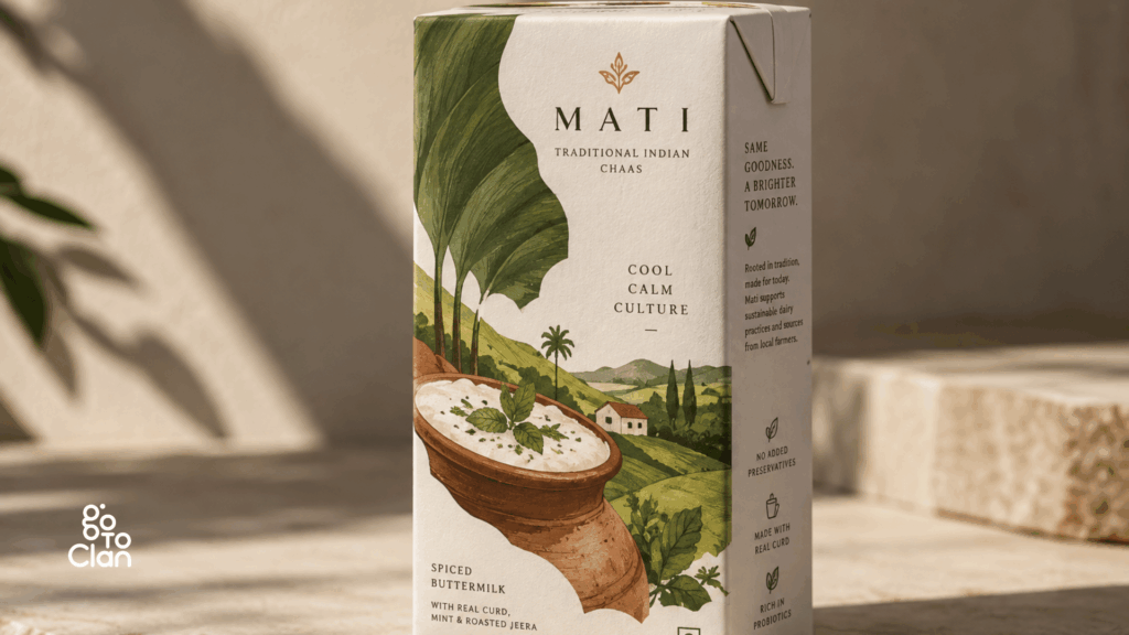
We also kept the typography simple and gave the illustrations enough space to stand out. The idea was to create a packaging design that feels modern, fresh, and easy to recognise on a crowded supermarket shelf. And the best part? We didn’t have to change the usual tetra pack format to achieve this look. Sometimes, even a simple change in colours, illustrations, and layout can make a familiar product feel completely different.
Concept 2: A Little More Desi, A Little More Earthy
Now, here’s another version of Mati, but with a completely different personality. This time, we took inspiration from the traditional matka and the earthy colours we associate with Indian kitchens. The rich terracotta brown instantly gives the packaging a warmer, more traditional feel. And instead of using English for the brand name, we went with a beautiful Devanagari logo that reads ‘माती’.
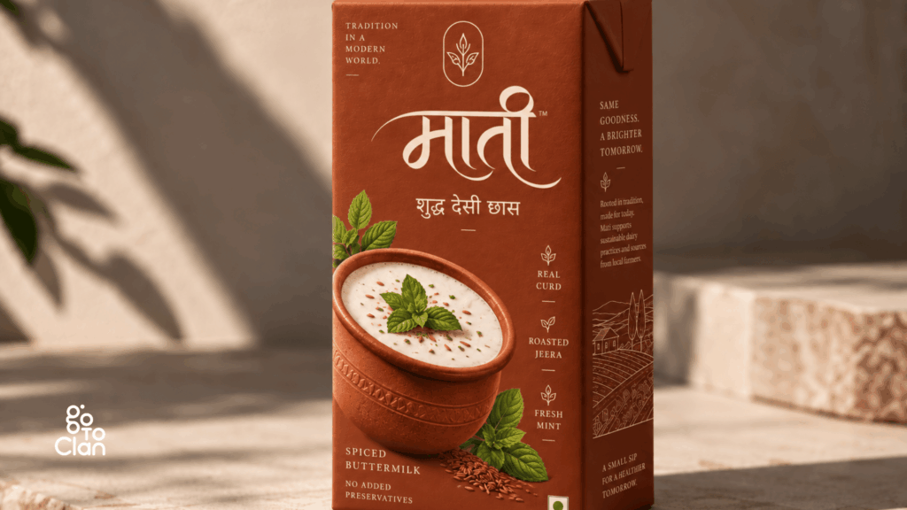
Look closely, and you’ll also notice the little details. The clay pot filled with chaas, fresh mint leaves, roasted jeera, and the subtle traditional illustrations on the sides. We wanted the label and packaging design to communicate the product’s Indian roots while still looking like something you’d happily pick up from a modern retail store. Both our concepts use the same basic tetra pack format, but see how much difference the colours and visual identity make?
What If ₹10 Chaas Had a ₹10 Lakh Packaging Budget?
Now, imagine walking into a premium store and spotting this beautiful Mati bottle. Would you immediately guess that it’s meant for buttermilk? Probably not! For this concept, we took inspiration from traditional Indian earthen pots and created a bottle that almost looks like a handcrafted piece of pottery. The rich brown colour, intricate white patterns, textured surface, and cloth-covered cap give it a completely different look from regular packaged chaas.
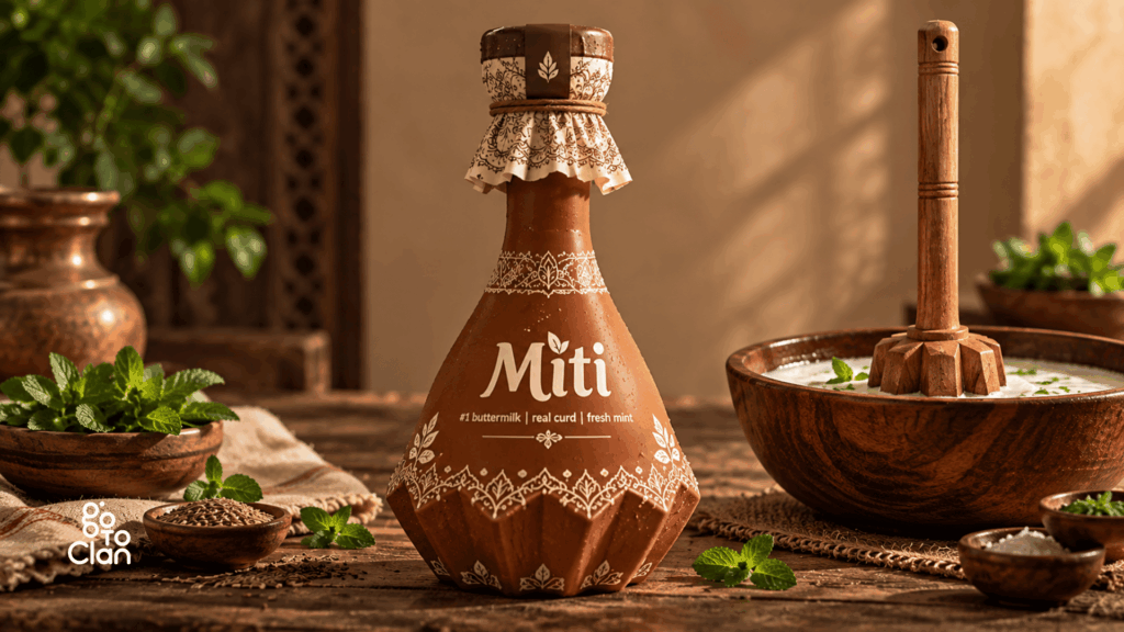
But here’s something interesting from a branding perspective. Creating a bottle like this would require a custom mould, which means the brand would have its own unique bottle shape. Apart from making the product instantly recognisable, this could also make it harder for counterfeit sellers to imitate the packaging and sell fake chaas under the brand’s name. Of course, a custom bottle alone cannot completely prevent counterfeiting, but it can add another layer of brand distinction.
And there’s another reason we love this concept. When customers pay a premium price for a product, they don’t just expect better quality inside. They also expect the packaging to feel special. Imagine picking up this textured bottle, opening the decorative cap, and pouring yourself a glass of chilled chaas. The entire experience feels more thoughtful, almost like buying something handcrafted.
Of course, producing such a bottle would involve expensive mould development, specialised manufacturing, and higher packaging costs. Not exactly practical for a ₹10 product! But that’s what makes this experiment interesting. It shows how FMCG packaging can go beyond simply protecting a product and become a part of the brand experience itself.
You can check out our exclusive food and beverage packaging design work here.
4. Instant Adhesive
And here’s a bonus concept we’re particularly excited about! Meet CHIPKU, our instant adhesive brand. Now, look closely at those two magnets. Both have their north poles facing each other. And if you remember your school science lessons, like poles repel each other. But here, they’re stuck together! That’s how strong CHIPKU is!
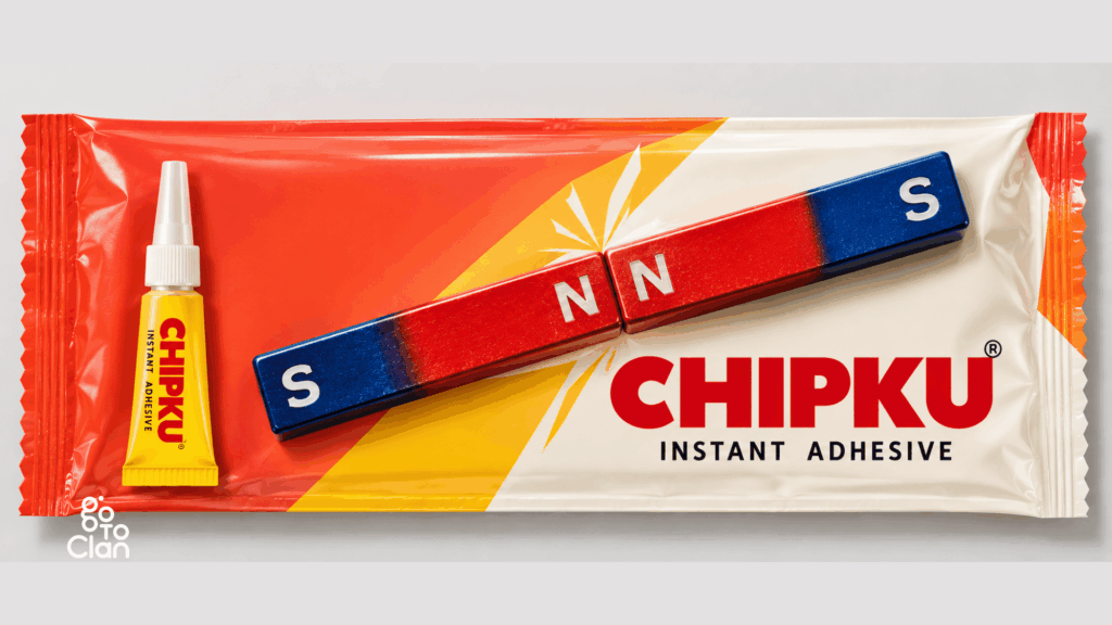
Now, THIS is the kind of packaging design we love experimenting with! No lengthy explanation, no complicated illustrations. Just one clever visual that communicates the product’s strength instantly. We wanted to create something that makes people stop, look twice, and smile when they get the idea. And once you see it, you simply cannot unsee it! That’s the power of a strong visual message.
Key Takeaways:
- Great packaging design doesn’t always need a big budget.
- Even ₹10 products can have a strong brand identity.
- Colours, typography, and illustrations can change how a product is perceived.
- Creative FMCG packaging helps products stand out on crowded shelves.
- Custom packaging shapes can improve brand recognition.
- Premium packaging can make the product experience feel more special.
- A clever visual can communicate more than a lengthy product description.
Final Words
So, does a ₹10 product really need a ₹10 lakh packaging budget? Absolutely not! But does it deserve better packaging design? Why not?
From matchboxes and cookies to chaas and instant glue, this little experiment reminded us that great label and packaging design isn’t always about expensive materials or fancy finishes. Sometimes, all it takes is a clever idea, the right colours, and a little imagination. And sometimes, a ₹10 product deserves to be treated like royalty, at least on our design screens!
After all, if two north poles can stick together, who’s stopping a ₹10 product from looking like a million bucks? Follow Go To Clan for more such cool blogs.
Frequently Asked Questions
1. What is the difference between label design and packaging design?
Label design focuses on the information, typography, and graphics printed on a product. Packaging design covers the entire package, including its shape, material, structure, and usability.
2. What should you look for in a packaging design agency in Mumbai?
Look for a packaging design agency in Mumbai that understands branding, printing techniques, material selection, and production costs. A good portfolio is important, but practical execution matters too.
3. What materials are commonly used for sachet packaging?
Sachet packaging typically uses flexible films made from plastic, foil, paper, or layered materials. The choice depends on the product’s shelf life, moisture sensitivity, and sealing requirements.
4. What information is mandatory on FMCG packaging in India?
Depending on the product category, FMCG packaging may require details such as net quantity, MRP, manufacturer information, batch number, and relevant dates. Food products must also follow applicable FSSAI labelling requirements.