Design and Marketing Head With 15+ Years of Experience
I hold a Bachelor of Applied Arts in Advertising, and my ideas come straight from everyday life, people, and strong beliefs. I turn simple observations into meaningful, creative work that brands can actually use.
What I do best:
• Help brands improve user experience with a single, clear approach to UX design, branding, and marketing
• Create eye-catching visuals for shopper marketing that drive attention at the point of sale
• Design packaging graphics that shape brand identity and influence buying decisions
• Build logos and visual identities for impactful branding campaigns
• Align brand strategy with long-term business vision, not just aesthetics
Industries I have worked with:
• Food and Beverages (India)
• Agriculture
• Sports, Print and Packaging, IT Solutions (UK-based companies)
• Fashion and Lifestyle
• Engineering Products
• Health and Pharma
• Technology
• Online Carpet Cleaning Services (Germany-based)
As the Creative Head at Go To Clan, I strongly believe that one powerful design can take a brand from recognition to lead conversion in a single move.
Blogs
When I say TATA, what comes to your mind? Assurity, reliability, strength, and trust! Every brand has a personality. Some feel fun, some feel serious, and some make you feel safe. That’s not random; it’s because of Brand Archetypes.
Brand Archetypes are like characters that brands play to connect with people emotionally. Based on Carl Jung’s psychology, there are 12 such archetypes. Once a brand fits into one of them, it becomes memorable. Let’s dive into each archetype, with Indian examples you’ll instantly recognize.
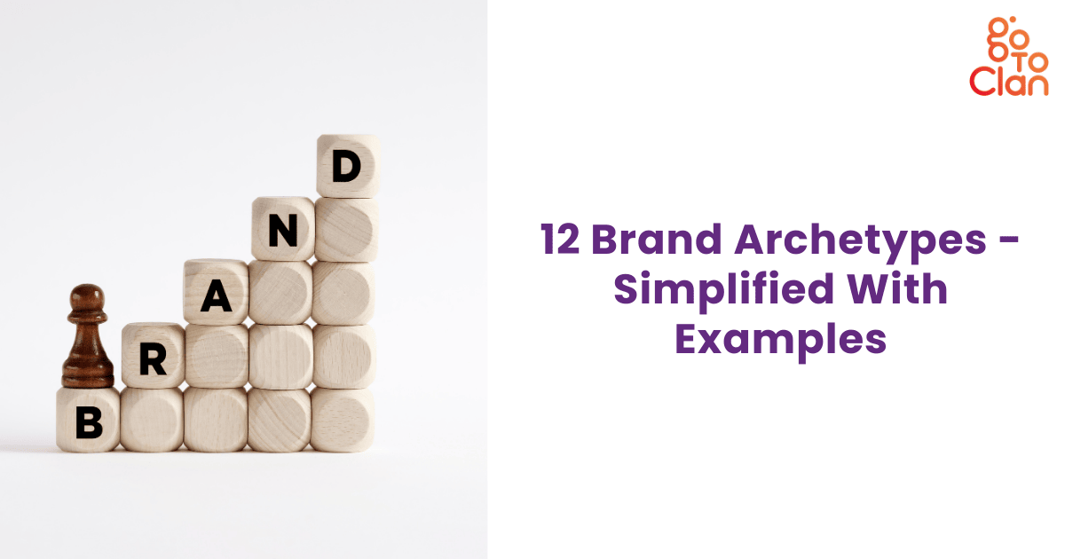
12 Brand Archetypes - Simplified With Examples
1. The Innocent
The first one in the Brand Archetypes is the innocent one. The Innocent archetype is all about purity, optimism, and joy. These brands want to make life simple and beautiful. They focus on trust, honesty, and spreading positivity. You’ll rarely find them using aggressive or negative messaging. Instead, they show you a world where things are safe and happy. That’s why Innocent brands often appeal to families and children. Amul is the best example in India. Its cheerful Amul girl has been spreading smiles for decades, with witty one-liners and wholesome campaigns. The brand makes you believe that their products are pure, trustworthy, and created with care. That’s Innocent branding done right.
2. The Everyman
Number 2 in the list of Brand Archetypes is Everyman; common and close to every person next door. The Everyman is the “people’s brand.” It’s not flashy, it’s not intimidating, and it doesn’t try to be exclusive. Instead, it focuses on being relatable and accessible to everyone. Everyman brands thrive because people don’t feel judged when they interact with them; they feel like they belong. FabIndia nails this perfectly. From its handwoven kurtas to home décor, it never tries to sell you luxury for status. Instead, it sells culture and comfort that connect to everyday Indians. That’s why both middle-class families and elite urban buyers shop there. The Everyman archetype wins hearts by being approachable, down-to-earth, and authentic.
3. The Hero
Another strong type in Brand Archetypes. Hero brands want to inspire. They thrive on courage, achievement, and strength. Their goal is to show people that with determination, they too can win. These brands often focus on overcoming challenges, celebrating victories, and pushing limits. Think about sports ads, full of energy, grit, and sweat. Globally, Nike is the Hero, but in India, we’ve grown up with brands like Boost telling us, “Boost is the secret of my energy.” Hero brands don’t just sell products; they sell motivation. They remind you that success is possible, but only if you put in the effort. That’s why Hero archetypes are unforgettable.
4. The Outlaw
Outlaw brands are rebels. They break rules, challenge norms, and attract those who want to stand out. They don’t care about playing it safe; they care about being bold. These brands thrive on controversy, rawness, and freedom. Royal Enfield is the classic Indian Outlaw; its rugged bikes scream independence and rebellion. Similarly, Fast Track targeted youth with bold, cheeky ads that literally told people to “Move On.” Outlaw brands often appeal to younger audiences who don’t want to blend in with the crowd. They succeed because deep down, people admire rule-breakers. They promise freedom and individuality in a conformist world.
5. The Explorer
The Explorer archetype loves freedom, curiosity, and self-discovery. Such Brand Archetypes are always in the news for their bold steps and experiments. Explorer brands encourage you to break routine and go find new experiences. They thrive on inspiring people to push boundaries, physically, mentally, or emotionally. These brands are never about staying safe in one place; they’re about exploring the unknown. Titan is a great Indian example. With campaigns like “Be More,” it told customers to express themselves and explore individuality beyond just telling time. Explorer brands don’t always mean adventure tourism; sometimes, they mean inner exploration and self-growth. Their messaging excites people who hate monotony and crave adventure in life.
6. The Creator
One of the most innovative Brand Archetypes. The Creator archetype is built on imagination, originality, and innovation. Creator brands don’t just want to sell, they want to make something meaningful and unique. They thrive on creativity, whether that’s through design, invention, or storytelling. Tata Motors is a strong example in India. From the humble Nano to the futuristic electric Nexon, Tata Motors constantly experiments and creates. They value design and practicality equally. Creator brands appeal to innovators, dreamers, and people who want products that feel different. Their message is clear: “We make things that didn’t exist before.” That creative spirit makes them unforgettable in competitive markets.
7. The Ruler
Ruler brands dominate. They represent power, authority, and control. These brands target customers who want to feel like leaders. The Ruler archetype is not about fun or simplicity; it’s about prestige. When you associate with a Ruler brand, you signal status. When we talk about Brand Archetypes, we can't forget about India's love for luxury cars. In India, Mercedes-Benz is a classic example. Owning a Mercedes is not just about driving; it’s about telling the world you’ve made it. Ruler brands succeed because people admire structure, luxury, and dominance. Their promise is simple: “We’re the best, and if you’re with us, you’re part of the elite.” That’s how they create loyal, aspirational customers.
8. The Magician
The Magician archetype transforms reality. These brands don’t just sell products; they create experiences that feel magical. They thrive on imagination, surprise, and wonder. Magician brands attract people who believe in possibilities beyond the ordinary. Globally, Disney is the best example, creating magical worlds for generations. In India, brands like Asian Paints sometimes step into this archetype, showing how a simple wall colour can transform the feeling of an entire home. Magician brands appeal because everyone secretly wants transformation. They tell you that magic isn’t just fantasy; it can be part of your everyday life. That’s why people trust them.
9. The Sage
The Sage archetype is all about knowledge and truth. Sage brands position themselves as teachers, guides, and trusted experts. They don’t shout, they inform. They don’t sell hype, they sell wisdom. In India, The Hindu is a great example; it’s serious, credible, and always focused on delivering insights. Another strong example is NITI Aayog, which positions itself as a source of knowledge and guidance for India’s growth and innovation. Sage brands attract customers who value intelligence and clarity. Their role is to educate and empower people with facts. They succeed because truth and wisdom never go out of fashion. ATALUP is another excellent example that fits properly in this arch. It helps students learn STEM in a fun way with household items. That’s thoughtful!
10. The Caregiver
Such Brand Archetypes are trusted and have a great number of loyal customers. Caregiver brands nurture and protect. They exist to make customers feel safe, supported, and cared for. Their message is always about compassion and trust. In India, Mother Dairy represents this perfectly. Its entire brand story is built around feeding families with love. Pampers is another example; it doesn’t sell diapers, it sells peace of mind to parents. Caregiver brands appeal deeply to emotions. They win because people want reassurance, especially when it comes to children, health, or family. Their biggest strength is empathy. They connect by saying, “We’re here to take care of you and your loved ones.”
11. The Lover
The Lover archetype celebrates intimacy, passion, and beauty. Lover brands focus on emotions, attraction, and elegance. They want customers to feel special, cherished, and desirable. Tanishq is the perfect Indian example. Their ads rarely talk about gold prices; they talk about relationships, weddings, and love stories. The brand makes jewellery a symbol of connection rather than just a product. Lover brands win because people want beauty and emotion in their lives. They’re not just buying an object; they’re buying a memory or a feeling. That’s why Lover brands always focus on emotional storytelling and aesthetics.
12. The Jester
The Jester archetype is the entertainer. Jester brands thrive on humour, playfulness, and fun. They don’t take life too seriously and remind their audience to enjoy the moment. In India, Fevicol has owned this space for decades with funny, clever ads that people remember forever. Another great one is Center Fresh gum, with its lighthearted, humorous campaigns. Jester brands appeal because laughter is universal. People love brands that make them smile. They succeed not just because of the product, but because of the joy they bring along with it. That’s how Jesters build strong emotional bonds with customers.
Wrapping It Up
Brand Archetypes help brands define who they are and how they connect with people. They’re not just about ads; they shape the entire personality of a business. Whether it’s Amul’s innocence, Royal Enfield’s rebellion, or Tanishq’s love, archetypes explain why we remember some brands forever. When your brand chooses its archetype, it gains a clear voice, consistency, and emotional power.
So, the next time you think about branding, don’t just ask “What do we sell?”, ask “Who are we?” Because in branding, personality is everything. And if you cannot find the answer to that question, Go To Clan can help!
Hope you have understood all 12 Brand Archetypes. Let us know in the comments section about your brand's Archetypes.
[post_title] => 12 Brand Archetypes - Simplified With Examples [post_excerpt] => [post_status] => publish [comment_status] => closed [ping_status] => open [post_password] => [post_name] => 12-brand-archetypes [to_ping] => [pinged] => [post_modified] => 2026-01-09 14:30:40 [post_modified_gmt] => 2026-01-09 14:30:40 [post_content_filtered] => [post_parent] => 0 [guid] => https://gotoclan.com/?p=2194 [menu_order] => 0 [post_type] => post [post_mime_type] => [comment_count] => 0 [filter] => raw )
As the founder of a creative agency, I receive numerous requests for an aesthetic and impactful brand guidelines template. Every large-scale group owning multiple brands must have a fixed brand guidelines template.
Every brand has one thing in common: consistency. Hence, I make sure that I am able to connect every dot of a brand’s story throughout the entire brand guideline book template. From logos and colors to tone of voice and design elements, consistency builds trust and recognition.
A brand guideline book is a rulebook for your brand. It decides and conveys how a brand should be addressed, seen, and perceived. It not only clarifies the visual identity of the brand but also sets a communication tone. Before we talk more about the brand guidelines template, let’s see what a brand guideline book is all about.
What is a brand guideline book?
This book tells everyone how your brand should look, sound, and feel wherever it appears; on websites, social media, ads, packaging, or even office stationery. If you think that branding is all about sticking a logo on your notepad and calling it a day, then this blog is for you.
Think of this book like a dress code and personality guide for your brand:
- What logo to use (and what not to do with it)
- Which colors and fonts represent the brand
- How to use images and graphics
- What kind of words and tone to use when writing
In simple words, a brand guideline book has your brand’s entire personality details. Why is a brand guidelines template important? It allows your team, your stakeholders, your clients, and even you to portray your brand publicly. From your company’s office boy to the CEO, everyone should convey the same brand message.
Important Things to Include in Your Brand Guidelines Template
1. About the Guideline
In this part, introduce the purpose of the brand guideline book. Make it clear that this is a reference manual for the entire company, from marketing teams to external partners. Explain that it helps maintain consistency across all brand communications and prevents misuse of brand assets. The goal here is to align everyone under the same brand identity.
2. Importance of Branding
Use this section to highlight why branding matters for business growth. Talk about how consistent branding builds trust, creates recognition, and differentiates a company in a competitive market. You can also mention that strong branding improves customer recall and helps in storytelling. This sets the stage for why guidelines are worth the effort.
3. Logo Introduction (Story Behind the Logo)
In this part of a brand guidelines template, explain the meaning and thought process behind your logo. Share whether it reflects your company’s history, values, or industry. A short narrative makes the logo more relatable and memorable. This is not about design details. It’s about what your logo stands for in the eyes of your audience.
For example, we are all familiar with the iconic Instagram logo. When it launched in 2010, the logo resembled a detailed vintage camera icon, reflecting the app’s focus on photography. As the platform grew beyond just photos to include videos, reels, and stories, the logo also evolved. In 2016, Instagram introduced the minimalistic gradient icon we know today: simple, colorful, and modern. This shift wasn’t just about design; it symbolized the brand’s transition from a niche photo-sharing app to a global storytelling platform.
4. Logo Placement and Clear Space
Define how your logo should be placed in different contexts. Show the minimum clear space required around the logo so it never feels cramped. Mention standard placements for documents, presentations, packaging, and digital platforms. This prevents design mistakes and ensures a clean, professional look.
5. Logo Sizes
Provide specific rules for logo resizing. List down the minimum and maximum sizes for print and digital use, ensuring legibility across formats like business cards, websites, and billboards. This avoids distortion and guarantees consistency in scale.
6. Incorrect Use of the Logo
It is important to tell what not to do along with what to do. Examples may include: stretching the logo, changing colors, adding shadows, or placing it on busy backgrounds. This section ensures that no matter who is working on your brand, they know what mistakes to avoid. Remember, this is an important step in the Brand Guidelines Template.
7. Primary Colors
List the official brand colors with exact HEX, RGB, and CMYK codes. Explain the primary palette (main brand colors) and, if needed, the secondary palette (supporting tones). Clarify where to use which, such as backgrounds, call-to-actions, or accents. This clarification is extremely important for your designers. It is used for social media posts, website design, product packaging, etc.
8. Font
Typography defines the tone of your communication. List your primary and secondary typefaces along with usage rules. For example, which font is for headings, body text, or digital ads? Keep this simple and specific so that all written material looks uniform. Your branding and marketing team can check the fonts for all online and print media. This is an important step in the Brand Guidelines Template.
9. Iconography
This section covers your icon style. Decide if your icons should be line-based, filled, monochrome, or colorful. Icons should complement your brand personality and make communication easier. Keep it short but clear.
10. Brand Essence Wheel
This part goes deeper. A brand essence wheel is the most important part of your brand guidelines template. It consists of 4 primary categories
- What the brand does for the consumer (Functional)
- How the buyer would describe the brand (Functional)
- How the brand makes the buyer feel (Emotional)
- How the brand makes the buyer look (Emotional)
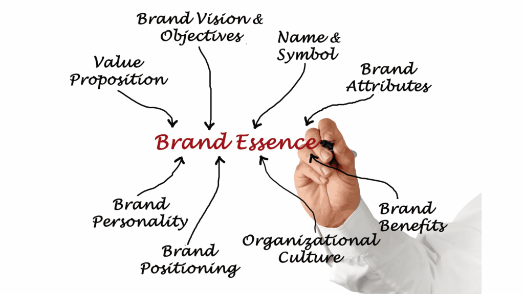
Ask your founding team to fill in all the blocks in a brand essence wheel. If you are starting fresh, you can describe how you want your audience to look at your brand. You can also describe how exactly you want them to feel about your brand. If you are an existing brand, you can draw 2 wheels: one about existing perceptions and one about expected perceptions. For instance, your clients look at your brand as a bold brand, but if you want them to look at your brand as a caring and empathetic brand, you can tweak your brand strategy accordingly.
11. User Persona
Here, list down multiple user personas and stakeholder personas. Describe who your ideal customer is, what their goals are, what pain points they face, and how your brand helps solve them. Include details like demographics, motivations, and behaviors. Also, define internal personas, such as investors or partners, to cover all stakeholders. This exercise helps businesses stay audience-focused when shaping communication.
12. Brand Strategy
A brand strategy is not just a few statements tucked away in a presentation. It is the roadmap that defines how a brand will be perceived, remembered, and loved over time. This section should lay down a crystal-clear vision of where the brand stands today and the direction it aspires to go tomorrow. Think of it as the guiding compass; every logo design, campaign, social post, or even customer service tone should tie back to this strategy.
At its heart, a good brand strategy defines three things:
- Positioning – What unique place does the brand occupy in the minds of customers?
- Target Audience – Who are we really speaking to, and what do they care about?
- Differentiation – What makes us stand out when compared to dozens of similar players?
To understand this better, let’s look at Apple. Today, Apple doesn’t just sell phones or laptops; it sells simplicity, premium design, and innovation that empowers creativity. Its positioning is clear: Apple is the brand for those who value elegant design and seamless user experience. Its target audience goes beyond just tech enthusiasts; it includes students, professionals, creators, and everyday people who want to feel empowered by technology. The differentiation? Apple’s ecosystem, design minimalism, and its ability to make technology feel human.
Now imagine if Apple didn’t define this clearly. It would simply be another gadget company competing on specs and price. But because it built a sharp strategy, it commands loyalty, commands premium pricing, and inspires communities worldwide.
Your brand needs the same clarity. Ask yourself: Are we solving a pain point, creating aspiration, or enabling transformation? If your target is Gen Z, then communication must be witty, visual, and digital-first. If your target is corporate, then the brand must exude professionalism, trust, and reliability.
A strong strategy doesn’t stop at today; it should also paint the picture of tomorrow. Where do you see your brand in five years? Do you want to be a household name like Amul in India, synonymous with trust? Or do you want to be aspirational like Tesla, shaping a movement bigger than just a product?
Think of this section of the Brand Guidelines Template as your brand’s North Star. It’s not just documentation; it’s an action plan that ensures consistency and focus across all branding activities. Every decision, big or small, should be tested against this strategy: Does this align with our positioning? Does this reflect our values? Does this take us closer to our vision?
13. Parameters of the Brand Story
Set the building blocks of your brand story: the purpose, the problem you solve, your journey, and your vision. These parameters make the story repeatable and consistent across all media. Without them, the brand narrative can feel scattered. While designing your Brand Guidelines Template, there is a good chance you might go on and on, and hence, to keep it crisp and impactful, you need to set these parameters.
14. Brand Story
This is where you weave everything into a compelling narrative. Share your journey, your mission, and your values in a way that connects emotionally with customers. The story should not sound like a sales pitch; it should humanize the brand and make it relatable.
For example, Nike’s story doesn’t start with shoes. It starts with a belief: “If you have a body, you are an athlete.” This simple yet powerful thought redefined sports and fitness.
The company began in 1964 as Blue Ribbon Sports, importing running shoes from Japan. But it wasn’t until the birth of the Nike name and the iconic “Swoosh” logo in 1971 that the brand truly took shape. Their mission wasn’t just to sell shoes; it was to inspire people to push their limits.
Nike built its story around empowerment, grit, and victory. Every campaign, from “Just Do It” to Serena Williams’ and Michael Jordan’s endorsements, reinforced the idea that greatness isn’t reserved for a few; it’s within everyone who dares to try.
The brand story is not about materials, soles, or laces. It’s about ordinary people doing extraordinary things. It’s about a runner who trains before sunrise, a student athlete who plays through challenges, or someone who simply puts on sneakers and decides to take control of their health.
This is why Nike resonates globally. The story is bigger than a product; it’s a movement. And that’s what every brand should aim for: a narrative that connects emotionally, inspires action, and builds loyalty.
15. Usage of the Story
Explain how the brand story should appear across platforms. For instance, the website version might be detailed, while the social media version is shorter and punchier. The key point: the essence stays the same, but the format adapts to the channel.
16. Brand Messaging Framework
This part is critical. Define your core brand message, supporting statements, and proof points. Think of it as a structured toolkit that anyone in your company can use when writing copy, pitching, or creating ads. A good messaging framework ensures that your communication is clear, aligned, and persuasive every time.
17. Brand Communication Examples
Add practical samples, like a sample LinkedIn post, an email draft, or a packaging mock-up. These show, don’t just tell, how the brand guidelines should be applied in real life. This helps teams visualize and execute better.
18. Brand Message Pillars and Proof Points
List the main themes (pillars) your brand wants to emphasize and provide proof for each. For example, if innovation is a pillar, the proof could be “500+ patents” or “recognized by industry awards.” This combination builds credibility and reinforces trust.
19. Imagery
Specify the style of images that represent your brand. Should they be bright and aspirational, clean and minimal, or raw and authentic? Define tone, composition, and dos/don’ts. Images are often the first impression, so this section sets the visual mood.
20. Product Usage Examples
Show how products should appear when used in real life. For instance, a tech product might be photographed in a modern office, while a fashion product might be shown in lifestyle shoots. This makes your products more relatable and aspirational.
21. Product Styling Examples
Here, set the rules for styling products in photoshoots. Define backgrounds, lighting, props, and settings. This ensures that no matter where your products appear, they always look like they belong to your brand.
22. Identity Design
Identity design ties everything together: logo, colors, fonts, imagery, and overall style. Explain that this is the visual DNA of the brand and should be consistent across every platform. A strong identity design ensures that the brand is instantly recognizable and trusted.
One-page brand Guidelines Template
Every brand should have a mini version of the lengthy 30-40 page brand guidelines book. You can design a one-page brand guidelines template.
So, what can you fit into just one page? Start with the logo. Show the main version, an alternate version if you have one, and a simple diagram explaining clear space. Many brands also add a small “don’ts” section here to prevent mistakes like stretching or recoloring the logo. Next, move to your color palette. Just three to five key swatches with HEX/RGB codes are enough to make sure your colors stay consistent everywhere, from social media to print.
The next block can cover typography and iconography. List the fonts for headings and body text with a small sample line so people know exactly how they’ll look. For icons, you don’t need a full library; just show the preferred style (outline, filled, or flat) so everything looks uniform. To balance visuals, add a section for imagery style with one or two sample photos that capture the mood of your brand, whether it’s clean and minimal, bold and vibrant, or people-focused.
Finally, close with brand voice and tone. This can be as simple as three keywords (like “friendly, bold, approachable”) and a sample line of copy that shows how your brand “speaks.” Some brands also include their tagline or three-message pillars here for quick recall. By fitting all this into a single sheet, you create a handy brand blueprint that anyone can follow, making it easier to keep your brand consistent without overwhelming teams with too much detail. One-page brand guidelines template can be very effective if designed smartly.
Figma Brand Guidelines Template Tips
- Start with a clear structure: Divide the template into sections like Logo, Colors, Typography, Imagery, and Voice so teams can find what they need quickly.
- Use Figma components: Create reusable logo, color, and text components so updates automatically reflect everywhere.
- Add color styles: Define HEX/RGB/CMYK codes in Figma styles to keep your palette consistent across designs.
- Set up typography styles: Save heading, subheading, and body fonts as text styles so the team doesn’t guess font sizes or weights.
- Show dos and don’ts visually: Use small examples to demonstrate correct vs incorrect logo usage instead of long explanations.
- Include brand voice snippets: Add sample copy to show tone, not just describe it; this helps non-designers too.
- Make it collaborative: Figma allows comments—encourage feedback directly in the file for easier alignment.
- Keep it visual and simple: Avoid heavy text; use swatches, icons, and mock-ups to make the guide scannable.
- Link to assets: Attach or link downloadable files (logos, fonts, icons) directly in Figma for easy access.
- Update regularly: Treat the template as a living document and refine it as your brand evolves.
Conclusion:
Hope you have understood the way of designing an impactful brand guidelines template. It is important to keep the guidelines simple and easy to understand. Be it a vendor or an employee, your brand’s story should be easily understood. At Go To Clan, we make sure that every brand gets a detailed brand guideline book. We can help you design your brand identity and keep it consistent across all platforms. Get a free Brand guideline template Figma. Email us at coffee@gotoclan.com
[post_title] => 22-Step Brand Guidelines Template Customized for Your Brand [post_excerpt] => [post_status] => publish [comment_status] => closed [ping_status] => open [post_password] => [post_name] => brand-guidelines-template [to_ping] => [pinged] => [post_modified] => 2026-01-09 14:30:26 [post_modified_gmt] => 2026-01-09 14:30:26 [post_content_filtered] => [post_parent] => 0 [guid] => https://gotoclan.com/?p=2202 [menu_order] => 0 [post_type] => post [post_mime_type] => [comment_count] => 0 [filter] => raw )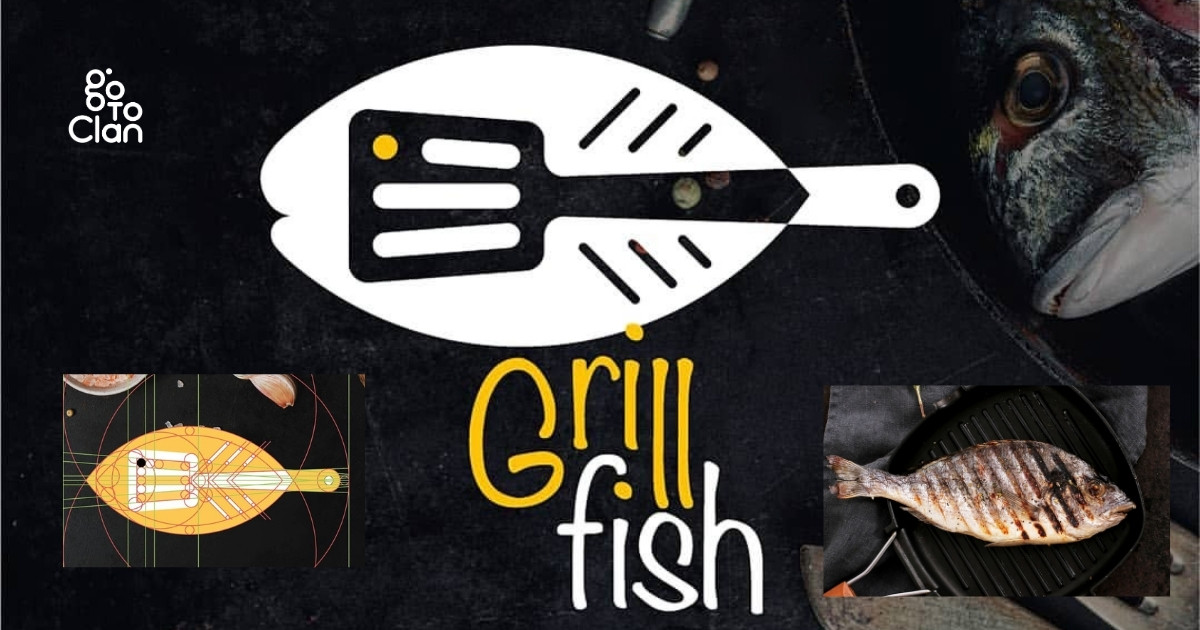
A Morphological Matrix is one of those tools that sounds complex but is actually very practical. Designers, marketers, and problem solvers use it to break a big idea into smaller parts and explore all possible combinations. Instead of waiting for a “creative spark,” this method gives you a clear system to generate ideas logically and creatively at the same time.
When you use a Morphological Matrix, you stop guessing and start exploring. You list down key elements of a problem, mix different options, and suddenly you have dozens of fresh concepts in front of you. It works especially well in design, branding, and strategy, where ideas need structure, not chaos.
Why is the Morphological Matrix Required in Problem Solving
The Morphological Matrix helps you think wider without losing control. Instead of jumping to the first idea that feels right, you explore multiple combinations in a structured way. This pushes creativity beyond habits and personal bias, which is exactly what good design and strategy need.
Many people also call it a Morphology Matrix, but the power stays the same. It turns vague thoughts into clear options, helps teams collaborate better, and makes idea generation faster and more confident. You do not wait for inspiration. You build it.
Here is the perfect example of the Morphology Matrix by Go To Clan
You can learn more about logo designing here:
How A Morphological Matrix Works (Step By Step)
Step 1: Define The Problem Clearly
Start with one clean line. What exactly do you need? A logo for a café, a landing page for a SaaS tool, a tagline for a travel brand. If your problem statement is messy, your ideas will also feel messy. This step sets the direction so you do not waste time exploring random concepts.
Step 2: Identify The Key Parameters
Now break the problem into parts that actually matter. Think of these as the “building blocks” of your final output. For a logo, you can pick parameters like icon style, typography, brand vibe, color family, and layout. For UI/UX, you can pick layout type, navigation style, interaction pattern, and content density. This is where the Morphological Matrix starts to become a system, not just brainstorming.
Step 3: Add Variations For Each Parameter
Under every parameter, list multiple options. Not one or two. Give yourself real range. Example: if the parameter is “icon style,” your options could be minimal line icon, bold solid icon, geometric icon, mascot, abstract mark, or lettermark. The goal is to create choices that feel different from each other, not small tweaks of the same idea.
Step 4: Create The Matrix Table
Put your parameters on the left and their variations across each row. Keep it simple. Even a rough table on paper works. This is the moment when ideas stop floating in your head and start becoming visible. A Morphology Matrix works best when your table looks clear enough that anyone on your team can understand it in 30 seconds.
Step 5: Mix And Match To Generate Concepts
Now pick one option from each parameter and combine them into a concept. Then repeat. You will quickly get 10, 20, or even 50 possible directions. Some combos will look bad, and that is fine. The real win is that you start finding unexpected combinations that you would never think of normally.
Step 6: Filter, Score, And Refine
Do not fall in love with every idea. Shortlist the best ones based on your goal. You can score them on simple things like brand fit, uniqueness, clarity, and usability. Then refine the top 3 to 5 concepts into stronger versions. This step turns raw combinations into real, usable directions.
Morphological Matrix in Logo Design
In logo design, a Morphological Matrix helps you break creativity into controllable parts instead of designing blindly. You separate a logo into elements like shape, typography, symbol style, and color logic, then explore combinations systematically. This method ensures your logo is not just “good looking” but also intentional, scalable, and aligned with brand meaning. Designers often sketch these combinations first to visually test balance, clarity, and recall before moving to digital execution.
Morphology Matrix Examples
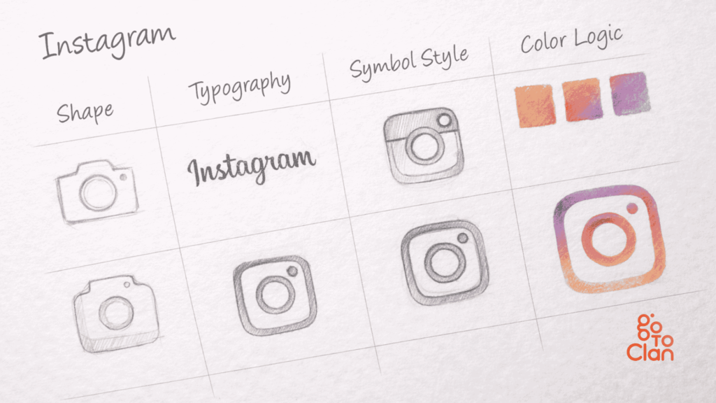
Instagram Logo
- Shape & Symbol: Rounded square and camera icon suggest simplicity, creativity, and instant sharing.
- Typography: Clean, friendly lettering that feels modern and informal.
- Color Logic: Gradient blend shows diversity, energy, and constant content flow.
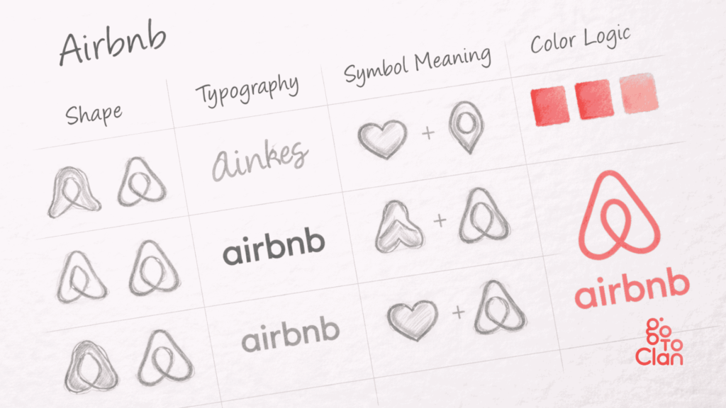
Airbnb Logo
- Shape & Symbol: Bélo symbol combines people, place, love, and belonging into one form.
- Typography: Soft, rounded lowercase type builds warmth and trust.
- Color Logic: Coral tone feels human, welcoming, and emotionally driven.
Morphological Matrix in UI/UX & Product Design
In UI/UX, a Morphological Matrix helps designers break digital experiences into parts like layout, interactions, visual patterns, and user flows. Instead of copying popular screens, you intentionally combine different UI decisions to create smoother, more intuitive products. This approach improves usability, reduces friction, and ensures every screen element serves a purpose rather than looking decorative.
Benefits of Using a Morphological Matrix
1. Faster Ideation
A Morphological Matrix removes the fear of starting. Instead of thinking “what should I design,” you already have defined elements and options in front of you. This structure speeds up ideation because you are not creating ideas from scratch. You simply combine, evaluate, and move forward. Teams generate more concepts in less time, and the process feels productive rather than exhausting.
2. Reduced Bias
When you use a Morphology Matrix, decisions stop depending on personal preferences or loud opinions in the room. Every parameter and variation gets equal attention. This reduces creative bias and forces designers and strategists to explore options they might normally ignore. The result is more objective thinking and more balanced design outcomes.
3. Scalable Ideas
Ideas created through a Morphological Matrix scale better because they come from a system, not intuition alone. Since every concept is built using defined components, it becomes easier to adapt the idea across platforms, formats, and future requirements. The Morphology Matrix ensures your ideas grow with the brand instead of breaking under expansion.
Common Mistakes While Using a Morphological Matrix
1. Unclear Problem Definition
Many people start a Morphological Matrix without clearly defining the problem. When the goal is vague, the matrix creates confusing combinations. Ideas feel disconnected and useless. Always write a clear problem statement before building the matrix. A strong start decides the quality of results.
2. Poor Parameter Selection
Another common mistake is choosing the wrong or weak parameters. If parameters do not matter to the design or product, the output will never work. People often add random elements just to fill the table. A good Morphology Matrix focuses only on elements that directly impact the final outcome.
3. Skipping Evaluation and Refinement
Some teams generate many combinations and stop there. They do not filter, test, or refine ideas. This wastes effort and creates chaos. A Morphological Matrix works only when you shortlist, score, and improve the best combinations. Selection is as important as generation.
Final Words
A Morphological Matrix helps you think clearly, create faster, and design with purpose. It turns messy ideas into structured options and gives creativity a direction. Whether you work on logos, UI/UX, or branding, this method helps you make confident design decisions instead of relying on guesswork.
At GoToClan, we use tools like the Morphological Matrix to build brands that actually work in the real world. We do not design for trends. We design with structure, logic, and creativity combined. If you want branding or design that feels intentional and scalable, this is exactly how we approach it.
[post_title] => Morphological Matrix Simplified: 6 Steps With Examples [post_excerpt] => [post_status] => publish [comment_status] => closed [ping_status] => open [post_password] => [post_name] => morphological-matrix-simplified-with-examples [to_ping] => [pinged] => [post_modified] => 2026-01-09 14:31:14 [post_modified_gmt] => 2026-01-09 14:31:14 [post_content_filtered] => [post_parent] => 0 [guid] => https://gotoclan.com/?p=2397 [menu_order] => 0 [post_type] => post [post_mime_type] => [comment_count] => 1 [filter] => raw )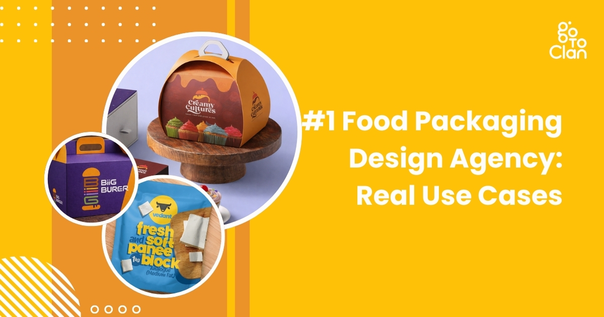
People often ask me why my food product is failing to set a unique brand identity. The answer is simple: you must stand out from the crowd.
Food packaging design is not decoration. It is branding and marketing in its most visible form. A smart food package design makes people stop, look, and buy. When the packaging feels unique yet relevant, you already win half the battle. Do your family members or friends read ingredients before buying a food item? Or do they check out nice-looking packaging? IYKYK.
We live in India, where packaging value matters emotionally, too. Offer coffee in a solid glass bottle, and many women will choose it just to reuse that bottle. That is the power of food box packaging design. It creates desire beyond the product itself and builds everyday brand recall.
So what makes Go To Clan a trusted food packaging design agency? Our designs stand out even when the shelf is full of your competitors’ products. We focus on clarity, attractiveness, and real-world buying behavior. Below are real use cases that show how the right food package design changes how products sell.
5 Best Food Packaging Design Real Use Cases
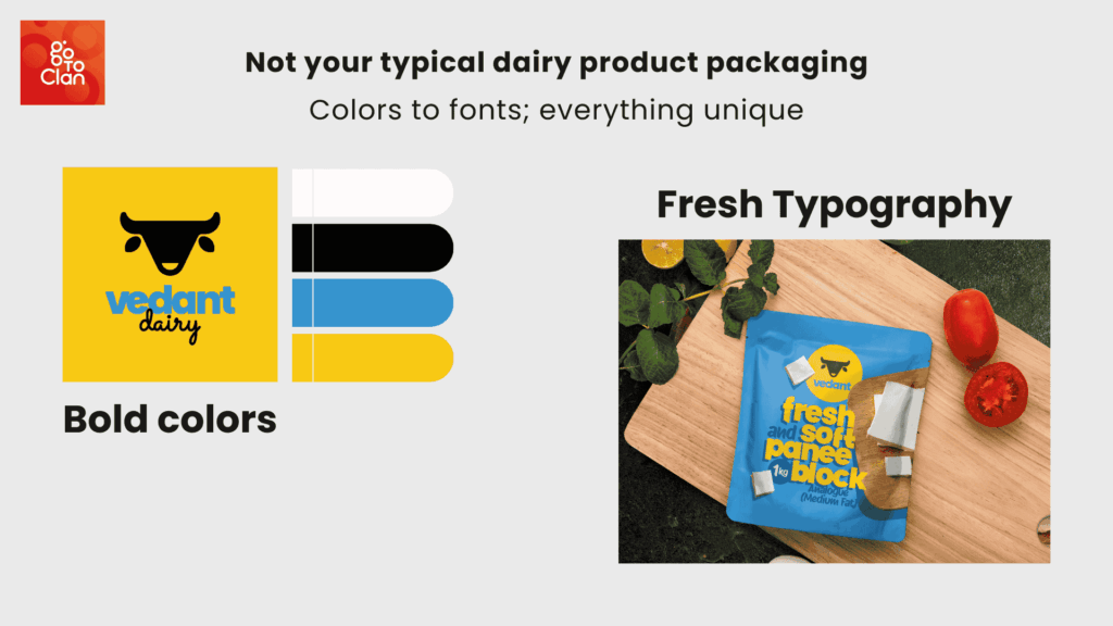
1. Vedant Dairy Paneer
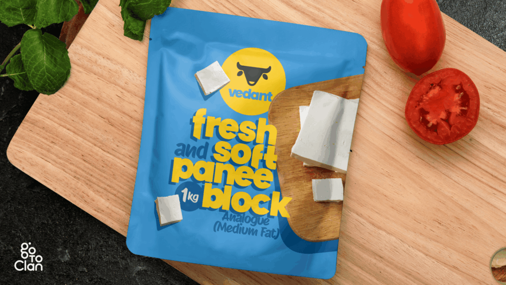
This paneer packaging is designed to break the monotony of the category. Most paneer packs look predictable, heavy, and repetitive. Here, the goal was simple. Make it feel fresh at first glance. The bright blue instantly separates it from the usual green, white, and dairy-heavy palettes seen on shelves.
Blue is not a random choice. In color psychology, blue signals freshness, trust, and hygiene. For a dairy product, these cues matter more than decorative elements. The yellow adds warmth and appetite appeal, creating balance so the pack feels friendly, not clinical. Together, the colors build contrast that grabs attention without looking loud.
The typography is bold, rounded, and highly legible. Paneer is a soft product, and the font mirrors that softness visually. No sharp edges, no rigid forms. This makes the product feel approachable and modern, unlike the typical traditional fonts that make paneer look dated.
2. Creamy Culture Unique Packaging
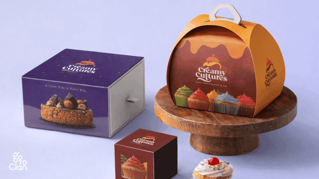
The first thing this food packaging design does is refuse to be ignored. The structure is not a regular box. The curved, handled form instantly signals that this is not a generic bakery product but a special-occasion dessert. The shape adds a sense of movement and celebration, almost like a gift rather than just packaging.
The handle is functional. It makes the box feel carry-worthy, share-worthy, and presentable straight out of the bakery. This design removes the need for extra wrapping and turns the packaging itself into part of the experience. It feels thoughtful, not transactional.
Color plays an equally strong role. The rich purple and warm orange create a bold contrast that feels indulgent and playful at the same time. Purple conveys premium and creativity, while orange brings warmth, joy, and appetite appeal. Together, they balance sophistication with fun.
Overall, this design works because form and color support each other. The unique shape draws attention first, and the vibrant palette keeps the eye engaged. On a shelf or at a party table, this packaging does not sit quietly. It performs.
3. Biiiiig Burger
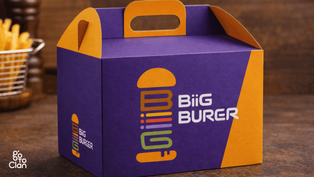
This food packaging design grabs attention without trying too hard. The purple and orange combo is bold and unexpected, which is exactly why it works. Most burger boxes play it safe with reds and browns. This one doesn’t. Purple makes the brand feel confident and a little premium, while orange keeps it fun, energetic, and food-friendly.
The logo is another win. It’s clean, playful, and instantly tells you what the brand is about. The stacked burger icon is smart and eye-catching, and the font feels modern and friendly. You don’t need to stare at it for long to get it. It just clicks.
The box itself feels strong and well thought out. It looks sturdy, easy to carry, and practical for takeaways. No flimsy packaging drama here. The handle is a small detail, but it adds a lot to the overall experience.
Overall, this is packaging that knows its job. It stands out, looks cool, and feels reliable. No overthinking, no clichés. Just a bold design that makes you notice the brand before you even open the box.
4. Archie’s Special Biryani
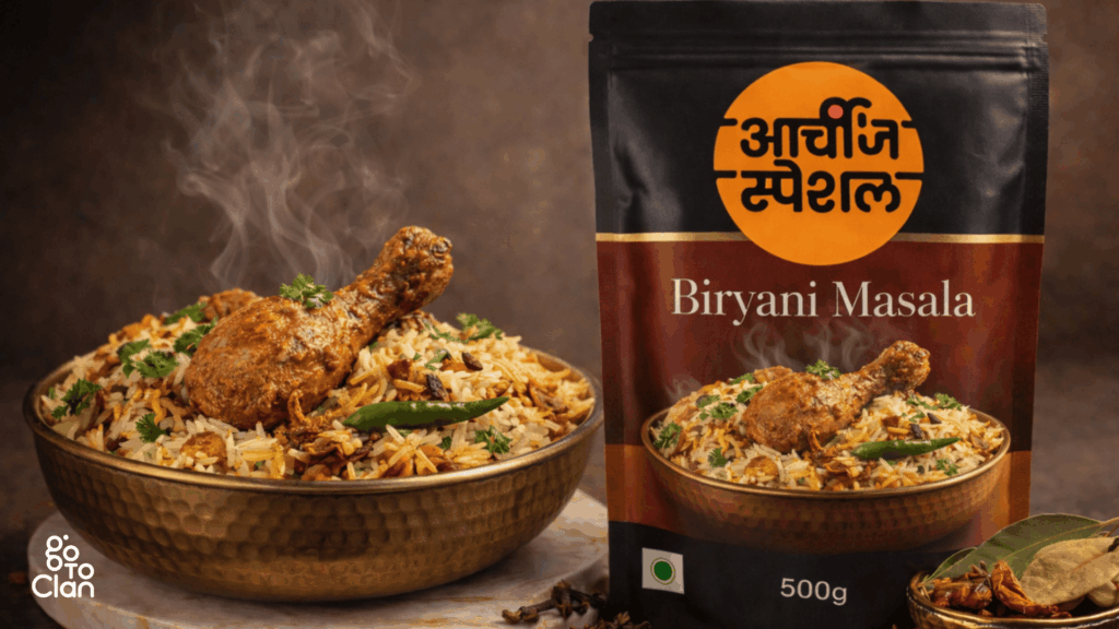
This is where packaging stops being just “good looking” and actually starts helping. The biggest problem the client shared was simple and real. People love biryani, but they always get confused about how much rice and water to add. Too dry, too soggy, too much guesswork.
So instead of adding more instructions on the back, the packaging itself became the solution. The pack is designed to be used as a measuring container. One pack of rice. Three packs of water. That’s it. No calculations, no kitchen maths, no stress.
This turns the packaging into a tool, not just a cover. Once the biryani is done, the customer remembers the brand for making life easier, not just tastier. That’s smart design. It solves a problem without shouting about it.
This is why this packaging is a winner. It understands the user, fixes a daily cooking issue, and adds real value beyond the product inside. When design helps you cook better, people don’t forget it.
5. Slice of Gold
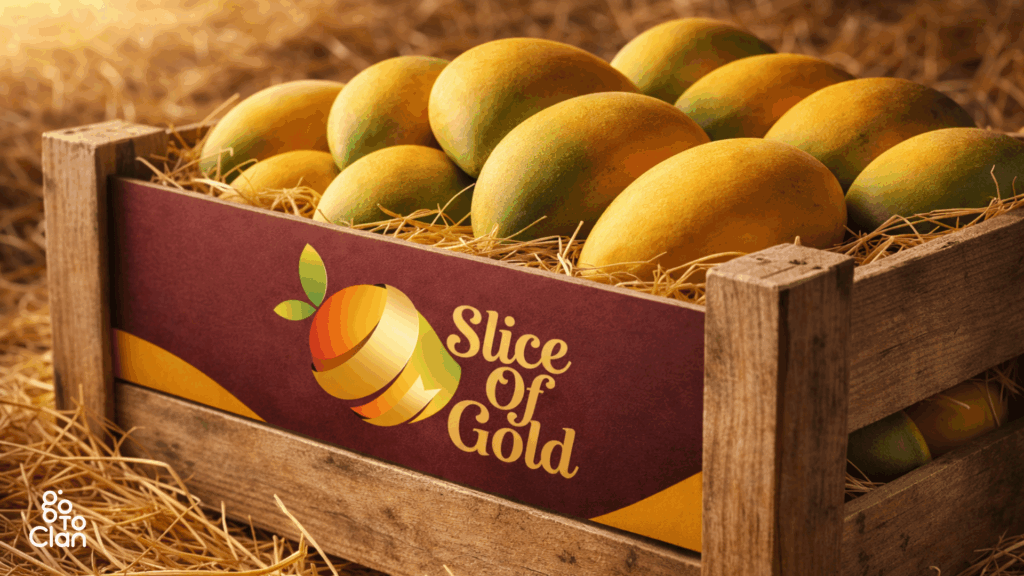
This food box packaging design is simple, and that’s exactly its strength. The wooden crate, natural textures, and warm colors do most of the talking. Nothing feels forced or overdesigned. It instantly gives a fresh-from-the-farm vibe, which is exactly what you want when you are selling fruits.
The branding stays subtle but confident. The colors feel rich and natural, and the logo blends in without stealing attention from the mangoes. It lets the product be the hero. No noise, no extra drama. Just clean, honest packaging that feels trustworthy and real.
5 Important Food Packaging Design Tips
1. Uniqueness Is Indispensable
If your food packaging looks like everyone else’s, people will treat it like everyone else’s. Being a creative head at the best food packaging design agency in India, I always focus on uniqueness.
In a crowded market, uniqueness is not a luxury; it’s survival. The moment a customer sees your pack, they should feel that this brand is doing something different.
Take Itminaan Biryani, for example. They don’t serve biryani in regular boxes. They serve it in actual clay pots. Real ones. With their name embossed on it. You don’t just eat the biryani, you experience it. That pot stays with you even after the meal is over.
That’s the power of unique packaging. It creates memory. People talk about it, click photos, and remember the brand without trying. When packaging becomes part of the story, marketing starts doing itself.
2. Focus On Colors
In food packaging design, colors speak before words do. Even before someone reads your brand name, the colors have already created a feeling. That feeling decides whether the customer pauses, picks it up, or walks past. So yes, color choice is a big deal.
Think about how certain colors instantly make you hungry, curious, or feel premium. Reds and yellows trigger appetite. Dark tones add richness. Soft pastels feel fresh and modern. When brands randomly pick colors, the packaging looks confused. When colors are intentional, the product feels right.
Good food packaging uses colors to match the food, the mood, and the audience. When done well, customers don’t even realize why they like the pack. They just know it feels appealing. And that’s exactly the point.
3. Useful Packaging
Good packaging is not just about looking good. It should make life easier. Easy to carry, easy to open, easy to use. These small things matter more than most brands realize, especially when people are busy or eating on the go.
The best part is when the packaging stays useful even after the product is used. That’s where smart design comes in. Take the Heinz bottle, for example. It’s actually a really smart one.
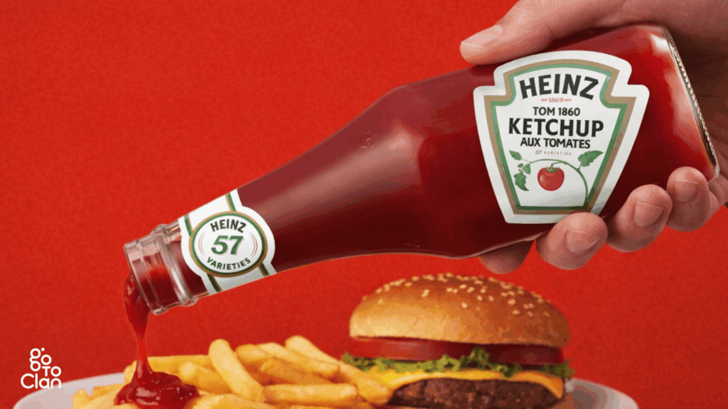
People always struggled to get ketchup out of the bottle. You had to shake it, hit it, wait forever, and then suddenly too much ketchup would come out. Heinz noticed this very real, very annoying problem. So instead of changing the ketchup, they flipped the bottle. Storing it upside down lets gravity do the work. Ketchup is ready when you are.
That small change did two things at once. It solved a daily user problem and made the bottle instantly recognizable. Today, when you see an upside-down ketchup bottle, you don’t even need to read the label. You already know it’s Heinz. That’s what happens when design listens to people instead of just looking good.
4. Consider The Nature Of Food
Every food has its own personality, and the packaging should respect that. Some food is delicate, some needs heat, some needs air, and some needs to stay sealed tight. If the packaging ignores this, the experience breaks, no matter how good the food is.
Imagine carrying biryani from a famous Hyderabad restaurant all the way to Vizag. The box might be strong, leak-proof, and fancy. But if the biryani turns cold by the time you reach, what’s the point? You wanted the taste, the aroma, the warmth. Not just safe delivery. Hence, keep in mind the nature of food, and then brainstorm on food box packaging design.
Good food packaging protects more than the food. It protects the experience. Temperature, moisture, and structure all matter. When brands design packaging around how the food is actually consumed, customers feel the care instantly.
5. Consider Your Budget
Everyone loves fancy packaging references. Pinterest, Instagram, international brands. All of it looks great on screen. But reality hits when you realize that ultra-unique shapes usually need new molds, custom tooling, and higher production costs.
Many clients want something never seen before, but when they hear the word “new mold,” the excitement suddenly drops. Custom packaging is expensive, especially at low volumes. If the budget doesn’t support it, the idea stays only as a reference, not a real product.
That’s why it’s important to align ideas with the budget from day one. Smart packaging is not about copying viral designs. It’s about creating something practical, scalable, and affordable. When budget and creativity move together, execution becomes smooth.
Final Words
Hope these tips were helpful. If you like what you just saw and read, and if you are looking for a good food packaging design agency in India, ping us.
The best packaging comes from understanding real user behavior. How people carry food, how they consume it, and what actually irritates them. When brands get this right, packaging becomes part of the experience, not just a wrapper.
If you’re planning a food brand or thinking of redesigning your packaging, start with these basics before chasing trends. And if you want packaging that looks good and works in the real world, this is exactly the kind of thinking we bring to Go To Clan.
[post_title] => #1 Food Packaging Design Agency: Real Use Cases [post_excerpt] => [post_status] => publish [comment_status] => closed [ping_status] => open [post_password] => [post_name] => food-packaging-design-agency [to_ping] => [pinged] => [post_modified] => 2026-01-21 12:37:13 [post_modified_gmt] => 2026-01-21 12:37:13 [post_content_filtered] => [post_parent] => 0 [guid] => https://gotoclan.com/?p=2440 [menu_order] => 0 [post_type] => post [post_mime_type] => [comment_count] => 0 [filter] => raw )